

Before Learning
Before creating tables and charts from a document, it helps to understand the basic ChatGPT document workflow.
Review these beginner guides first:
· ChatGPT Basics for Beginners: Complete Guide (2026)
· How to Analyze Documents with ChatGPT: Beginner Guide (2026)
· How to Extract Information from Documents with ChatGPT: Beginner Guide (2026)
· How to Ask Questions About Documents with ChatGPT: Beginner Guide (2026)
These guides explain how to upload documents, ask clear questions, find important information, and check ChatGPT’s answers. Those skills will make it easier to turn document information into organized tables and useful charts.
What You’ll Learn
In this beginner guide, you will learn how to:
· Upload a document to ChatGPT.
· Identify information that can be organized into a table.
· Ask ChatGPT to create a clear table from document content.
· Choose a suitable chart for different types of information.
· Ask ChatGPT to create bar, line, pie, and comparison charts.
· Improve table headings, labels, and formatting.
· Check numbers and categories against the original document.
· Correct missing, duplicated, or inaccurate information.
· Copy or export tables and charts for use in other programs.
· Protect private information and use document data responsibly.
· Understand the benefits and limitations of creating tables and charts with ChatGPT.
By the end of this guide, you should be able to turn suitable information from a document into a simple, organized table or chart and verify that the result matches the original source.
Introduction
Documents often contain useful information that is difficult to compare quickly. A report may include numbers spread across several paragraphs, a research paper may list results in different sections, or a business document may contain dates, expenses, categories, and totals without presenting them in one clear place.
ChatGPT can help organize suitable document information into a table. A table arranges information into rows and columns, making it easier to compare names, dates, amounts, categories, results, or other details.
ChatGPT can also use numerical information to create charts. A chart presents data visually so that you can more easily notice differences, patterns, proportions, and changes over time. Depending on the information, ChatGPT may create a bar chart, line chart, pie chart, scatter chart, or another suitable chart type. Some charts may be interactive, while others are provided as static images.
The basic process is simple:
1st Upload the document.
2nd Tell ChatGPT what information to find.
3rd Ask it to organize the information into a table.
4th Check the table against the original document.
5th Ask ChatGPT to create a suitable chart.
6th Review the labels, values, and chart type.
ChatGPT supports many common document and data formats, including PDF, DOCX, TXT, CSV, XLS, and XLSX files. Available features, upload limits, and chart options may vary depending on your ChatGPT plan, model, workspace settings, and future updates.
Creating a table or chart does not automatically make the information accurate. ChatGPT may misunderstand a document, overlook a value, combine unrelated information, or select an unsuitable chart. You should always compare the result with the original source before using, sharing, or publishing it.
This guide will take you through the complete process using simple instructions and practical examples.
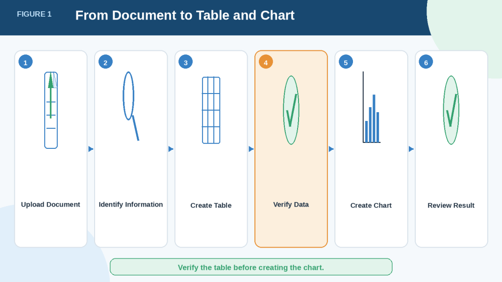
Figure 1. The basic workflow for turning information from a document into a checked table and chart.
A reliable result requires more than uploading a document and requesting a chart. The information should first be identified and organized, then checked against the original document before it is presented visually.
What Are Tables and Charts?
Tables and charts organize information in different ways. A table shows exact details, while a chart helps you see patterns and comparisons quickly.
What Is a Table?
A table arranges information into rows and columns.
Each column normally represents one type of information, such as:
· Product name
· Date
· Category
· Quantity
· Price
· Result
Each row usually represents one item, person, date, event, or record.
For example, a document may contain the following information in several paragraphs:
· January sales were $1,200.
· February sales were $1,450.
· March sales were $1,700.
ChatGPT could organize this information into a simple table:
| Month | Sales |
| January | $1,200 |
| February | $1,450 |
| March | $1,700 |
A table is useful when you need to read, copy, compare, or verify exact values.
What Is a Chart?
A chart turns information into a visual format.
For example, the same monthly sales information could be displayed as a bar chart or line chart. Instead of reading each value separately, you could quickly see that sales increased from January to March.
Charts are useful for showing:
· Differences between categories
· Changes over time
· Parts of a total
· Highest and lowest values
· Relationships between two sets of numbers
A chart should make information easier to understand. It should not hide important details or make the results appear more dramatic than they really are.
Table or Chart: Which Should You Use?
Use a table when exact values are important.
Use a chart when the main goal is to show a pattern, comparison, proportion, or trend.
In many cases, the best approach is to use both. The table provides the exact data, while the chart gives readers a quick visual summary.
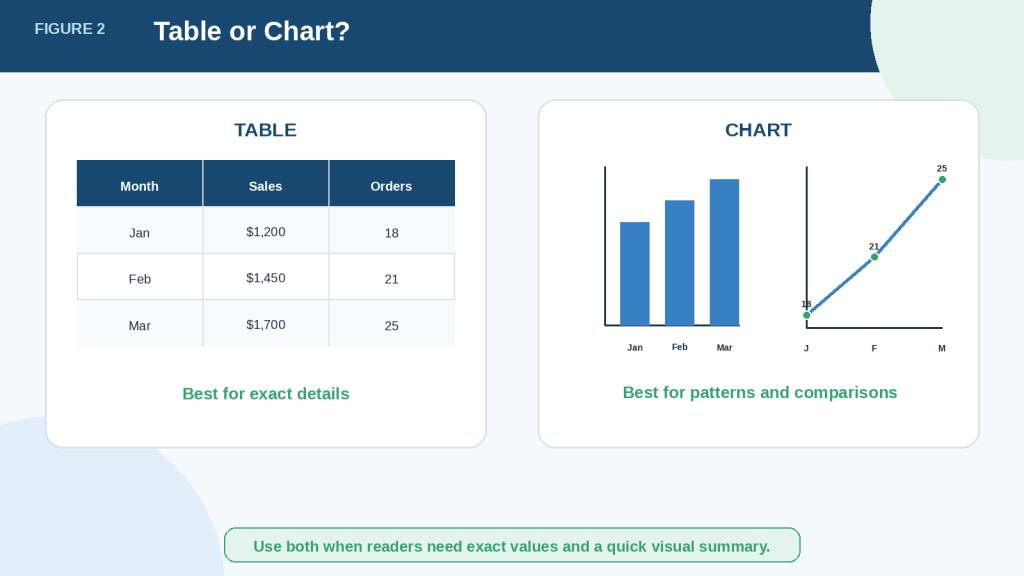
Figure 2. Tables show exact values, while charts make patterns and comparisons easier to notice.
A table and chart can present the same information in different ways. The table helps readers check precise values, while the chart provides a faster visual overview. Using both can make document information clearer and easier to verify.
What Information Can ChatGPT Turn into Tables and Charts?
ChatGPT can organize many types of information from documents, but the information must be suitable for comparison or measurement.
Information That Works Well in Tables
Tables are useful for information with repeated categories or details, such as:
· Names and contact details
· Dates and events
· Products and prices
· Expenses and income
· Survey answers
· Test results
· Project tasks and deadlines
· Features and specifications
· Advantages and limitations
· Research findings
· Inventory records
· Monthly or yearly totals
For example, a project report may describe several tasks in separate paragraphs. ChatGPT could organize them into columns such as:
| Task | Person Responsible | Deadline | Status |
| Review document | Maria | August 5 | In progress |
| Correct errors | James | August 8 | Not started |
| Submit final copy | Maria | August 10 | Not started |
This format makes the information easier to scan and compare.
Information That Works Well in Charts
Charts work best when the document contains numbers that can be compared.
Suitable information may include:
· Sales by month
· Expenses by category
· Survey response percentages
· Number of customers by region
· Website visits over time
· Test scores by subject
· Products sold by category
· Project progress percentages
· Population or attendance figures
· Changes in costs, income, or performance
For example, a yearly report may include monthly visitor numbers. A line chart could show whether the number of visitors increased, decreased, or stayed approximately the same during the year.
Information That May Not Work Well
Not every part of a document should become a table or chart.
Information may be unsuitable when it is:
· Mainly opinion or personal interpretation
· Too vague to classify
· Missing important values
· Written in an inconsistent format
· Based on unrelated categories
· Descriptive rather than measurable
· Too limited to show a meaningful pattern
A chart created from weak or incomplete information can look professional while still being misleading.
Reality: ChatGPT cannot create reliable data that does not exist in the document. It may estimate, assume, or fill gaps unless you clearly tell it not to do so.
A useful instruction is:
Use only information stated in the document. Do not estimate missing values or add information from outside sources. Mark any missing value as “Not provided.”
This instruction helps separate confirmed document information from missing information.
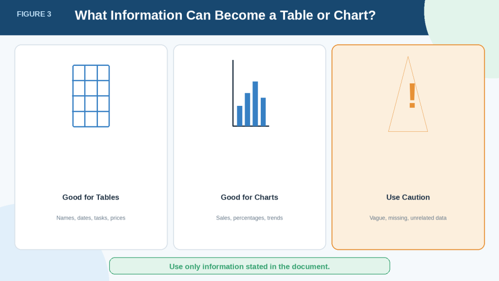
Figure 3. Tables and charts work best when a document contains clear, repeated, and measurable information.
Some document information can be organized easily, while other information may be vague, incomplete, or unsuitable for visual comparison. Checking the quality of the source information before creating a table or chart reduces the risk of producing a misleading result.
What You Need Before You Begin
A little preparation can prevent missing values, incorrect tables, and misleading charts.
A Suitable Document
ChatGPT supports many common document and data formats, including PDF, DOCX, PPTX, TXT, CSV, XLS, XLSX, and TSV. Available file types and features may vary by model, plan, workspace settings, and account capabilities.
Choose a document that contains information suitable for organizing or comparing, such as:
· Names and categories
· Dates and events
· Prices and quantities
· Monthly or yearly totals
· Survey results
· Test scores
· Project tasks and deadlines
· Product features
· Expenses and income
A Clear Goal
Before uploading the document, decide what you want the table or chart to show.
For example, you may want to:
· Compare expenses by category.
· show sales changes over time.
· organize project tasks by deadline.
· compare features from several products.
· display survey responses as percentages.
· identify the highest and lowest values.
A clear goal helps ChatGPT choose the correct information and organize it properly.
Instead of asking:
Make a chart from this document.
Use a more specific instruction:
Find the monthly sales totals in this document. Organize them into a table with columns for Month and Sales, and then create a line chart showing how sales changed over time.
A Clear and Readable Source
Text-based documents and well-organized spreadsheets usually produce more reliable results than scanned pages, photographs, or complicated layouts.
When preparing spreadsheet data, clear column headings, plain-language labels, and one record per row make the information easier to analyze. Empty rows, unrelated tables on the same sheet, and values stored only inside images can cause problems.
ChatGPT may not reliably extract exact values from:
· Scanned PDFs
· Photographs of tables
· Handwritten documents
· Blurred or low-quality pages
· Tables with merged or overlapping cells
· Documents with complicated visual layouts
When exact numbers matter, use a text-based document or spreadsheet whenever possible. OpenAI specifically warns that exact values may not be extracted reliably from image-based tables and scanned files.
Permission to Use the Information
Make sure you have permission to upload and use the document.
Do not upload confidential, private, copyrighted, medical, financial, employment, customer, or business information unless you are authorized to use it and understand the applicable privacy and data-handling requirements.
Remove unnecessary personal information, including:
· Full names
· Home addresses
· Telephone numbers
· Email addresses
· Account numbers
· Identification numbers
· Medical details
· Passwords
· Private business information
Files uploaded to ChatGPT are handled according to the account, plan, retention rules, and data-control settings. These policies and settings may change, so check the current official information when first using file uploads, after changing plans, or after receiving a policy-update notice.
The Original Document
Keep the original document open or easily available.
You will need it to:
· Check extracted values.
· Confirm headings and categories.
· Find missing information.
· Correct spelling and dates.
· Verify totals and percentages.
· Confirm that the chart represents the source fairly.
Never delete or replace the original file after ChatGPT creates a table or chart. Keep the original document, the prompt you used, the corrected data, and the final exported files as part of your records.
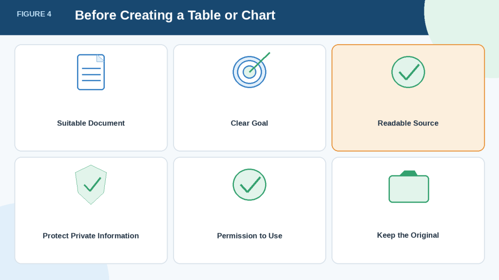
Figure 4. Preparing the document and protecting its information can reduce errors before creating a table or chart.
A clear goal, readable source, proper permission, and access to the original document are essential parts of the workflow. This preparation helps ChatGPT identify the correct information and allows you to verify the finished table or chart before using it.
How to Upload a Document and Ask ChatGPT for a Table
The first practical step is to upload the document and clearly explain what information you want ChatGPT to organize.
Step 1: Start a New Chat
Open ChatGPT and start a new conversation.
Using a separate chat can help keep the document, instructions, corrections, and final table together in one place.
Step 2: Upload the Document
Select the attachment, paperclip, or plus button near the message box. The exact button may vary depending on your device, ChatGPT version, plan, or update.
Choose the document from your computer or device and wait for the upload to finish before sending your instructions.
Step 3: Describe the Information You Need
Tell ChatGPT exactly what information to find.
A vague request such as:
Create a table from this document.
may produce a table that includes the wrong details or uses unsuitable headings.
A clearer request is:
Read this document and find all project tasks, responsible people, deadlines, and current status. Organize the information into a table with the columns Task, Person Responsible, Deadline, and Status.
This prompt tells ChatGPT:
· What information to find
· Which details to include
· How to name the columns
· How to organize the result
Step 4: Tell ChatGPT Not to Guess
Documents may contain missing, unclear, or incomplete information.
Add an instruction such as:
Use only information stated in the document. Do not estimate or invent missing details. Write “Not provided” when information is missing.
This helps prevent ChatGPT from filling empty spaces with unsupported information.
Step 5: Request Source References When Possible
For longer documents, ask ChatGPT to identify where each value came from.
For example:
Add a final column called Source Location. Include the page number, section heading, or paragraph where each item was found.
Source references can make the table easier to verify. However, page numbers and locations may still be incorrect, especially when a document has unusual formatting or scanned pages. Check every important reference against the original document.
Complete Example Prompt
Read the uploaded report and identify every monthly sales total. Create a table with the columns Month, Sales, and Source Location. Keep the months in chronological order. Use only information stated in the document. Do not estimate missing values. Write “Not provided” when a value is missing. After creating the table, explain any unclear or conflicting information you found.
Step 6: Review the First Table
Do not copy or publish the first table immediately.
Check whether ChatGPT:
· Used the correct headings
· Included every relevant item
· Kept categories consistent
· Copied names and dates correctly
· Preserved the correct units and currencies
· Marked missing information clearly
· Avoided adding unsupported details
The first table should be treated as a draft until it has been compared with the original document.
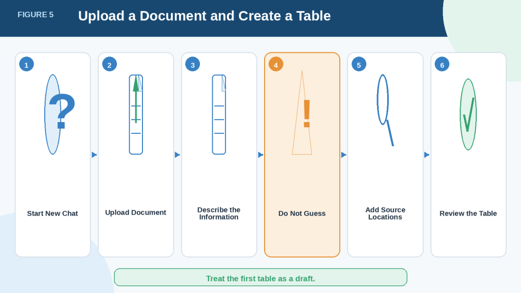
Figure 5. Clear instructions help ChatGPT extract document information and organize it into a more useful table.
Uploading the document is only the beginning. ChatGPT needs specific instructions about the information to find, the columns to create, how to handle missing values, and whether source locations should be included. The finished table must then be checked against the original document.
How to Improve and Correct a Table
The first table ChatGPT creates may need changes. You can ask ChatGPT to improve the headings, order, formatting, and consistency without starting again.
Make the Headings Clearer
Column headings should be short, specific, and easy to understand.
For example, replace unclear headings such as:
· Information
· Amount
· Details
· Result
with clearer headings such as:
· Product Name
· Monthly Sales
· Deadline
· Survey Result
Example prompt:
Rename the table headings so they clearly describe the information in each column. Do not change any values.
Change the Column Order
Place the most important information first.
For example, a project table may be easier to read in this order:
1st Task
2nd Person Responsible
3rd Deadline
4th Status
5th Source Location
Example prompt:
Reorder the columns as Task, Person Responsible, Deadline, Status, and Source Location. Keep all existing information unchanged.
Sort the Rows
You can ask ChatGPT to sort the table by:
· Date
· Name
· Category
· Highest or lowest value
· Project status
· Alphabetical order
Example prompt:
Sort the rows by deadline, starting with the earliest date. Do not remove any rows.
Standardize Dates, Numbers, and Labels
Documents sometimes use different formats for the same type of information.
For example, dates may appear as:
· January 5, 2026
· Jan. 5, 2026
· 05/01/2026
Ask ChatGPT to use one consistent format:
Change all dates to the format Month Day, Year. Do not change the meaning of any date.
You can also standardize:
· Currency symbols
· Decimal places
· Percentages
· Capitalization
· Category names
· Measurement units
· Status labels
For example, a document may use “In progress,” “Ongoing,” and “Started” for the same status. You may ask ChatGPT to standardize these terms, but only after confirming that they have the same meaning.
Add Missing-Information Labels
Empty cells can be confusing because readers may not know whether the information was missing or accidentally omitted.
Example prompt:
Replace every empty cell with “Not provided.” Do not guess or create missing information.
Remove Unnecessary Information
A table may become difficult to read when it includes too many columns.
Ask ChatGPT to keep only the details needed for your purpose:
Create a simplified version of the table containing only Month, Sales, and Source Location. Keep the full table unchanged and show the simplified version separately.
Keeping the original table makes it easier to recover information later.
Ask ChatGPT to Identify Possible Problems
ChatGPT can review the table for inconsistencies, but you must verify its findings.
Example prompt:
Review this table and identify possible duplicate rows, inconsistent labels, missing values, conflicting totals, or unusual entries. List the possible problems separately. Do not correct them until I approve the changes.
This approach allows you to review each suggested correction before the table is changed.
Compare the Improved Table with the Original
After making changes, check that ChatGPT has not:
· Changed an amount
· Altered a date
· Combined separate records
· Removed an important row
· Changed the meaning of a category
· Replaced missing information with an assumption
· Converted numbers into the wrong unit
Formatting improvements should not change the source information.
How to Avoid This Mistake: Tell ChatGPT exactly what it may change and what it must preserve. For example, say, “Improve the headings and formatting, but do not change, calculate, summarize, or remove any values.”
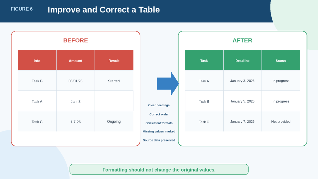
Figure 6. A table can be improved without changing the information taken from the original document.
Clear headings, consistent formats, logical ordering, and visible missing-information labels make a table easier to understand. However, every improvement should preserve the original values and meaning so that formatting changes do not introduce new errors.
How to Choose the Right Chart Type
Choosing the correct chart is important because different charts answer different questions. A chart may contain accurate numbers but still confuse readers when the wrong chart type is used.
Before creating a chart, ask:
· What do I want readers to notice?
· Am I comparing categories?
· Am I showing change over time?
· Am I showing parts of one total?
· Am I looking for a relationship between two numerical values?
Use a Bar Chart to Compare Categories
A bar chart compares separate items or categories.
It works well for information such as:
· Expenses by category
· Sales by product
· Survey answers
· Students by course
· Website visits by source
· Tasks completed by team
The length or height of each bar represents the value.
Example prompt:
Use the verified table to create a bar chart comparing total expenses for Rent, Utilities, Transportation, Food, and Advertising. Add a clear title and label both axes.
A bar chart is usually easier to read than a pie chart when there are many categories or when the values are close together.
Use a Line Chart to Show Change Over Time
A line chart shows how a value changes across an ordered period.
It works well for:
· Monthly sales
· Weekly website visits
· Yearly expenses
· Daily temperatures
· Project progress over time
· Customer totals by quarter
Example prompt:
Create a line chart showing monthly sales from January to December. Keep the months in chronological order and show the sales amount for each month.
Do not use a line chart for categories that have no meaningful order, such as product names or departments.
Use a Pie Chart to Show Parts of One Total
A pie chart shows how a total is divided into parts.
It may be useful for:
· Budget percentages
· Market shares
· Survey response proportions
· Expense distribution
· Customer groups
Example prompt:
Create a pie chart showing each expense category as a percentage of the total annual expenses. Include the category name and percentage for every section.
A pie chart works best when:
· The values form one meaningful total.
· There are only a few categories.
· The differences between categories are easy to see.
Avoid using a pie chart when there are many small categories, negative values, overlapping totals, or values that do not add up to one whole.
Use a Scatter Chart to Show a Possible Relationship
A scatter chart compares two numerical measurements.
It can help show whether two values may be related, such as:
· Advertising cost and sales
· Study hours and test scores
· Product price and customer rating
· Temperature and energy use
· Employee experience and salary
Each point represents one record.
Example prompt:
Create a scatter chart using Advertising Cost on the horizontal axis and Sales Revenue on the vertical axis. Label the axes clearly and do not claim that one value caused the other.
A visible pattern may suggest a relationship, but it does not prove that one factor caused the other.
Use a Table Instead of a Chart When Exact Values Matter Most
A chart is not always necessary.
Keep the information as a table when:
· Readers need exact values.
· The document contains names, dates, or detailed notes.
· There are only one or two records.
· The categories cannot be compared meaningfully.
· The information is mostly text rather than numbers.
· A chart would make the information harder to understand.
Ask ChatGPT to Recommend a Chart
You may ask ChatGPT to recommend a chart before creating one.
Example prompt:
Review this verified table and recommend the most suitable chart type. Explain what question the chart would answer, why that chart is appropriate, and any limitations. Do not create the chart until I approve the recommendation.
This gives you a chance to review the suggestion before ChatGPT creates the visual.
Reality: ChatGPT may recommend a chart that looks attractive but does not represent the information clearly. The final choice should depend on the purpose of the data, not only on appearance.
Quick Chart-Selection Guide
| Your Main Goal | Suitable Format |
| Show exact values | Table |
| Compare categories | Bar chart |
| Show change over time | Line chart |
| Show parts of one total | Pie chart |
| Explore a relationship between two numerical values | Scatter chart |
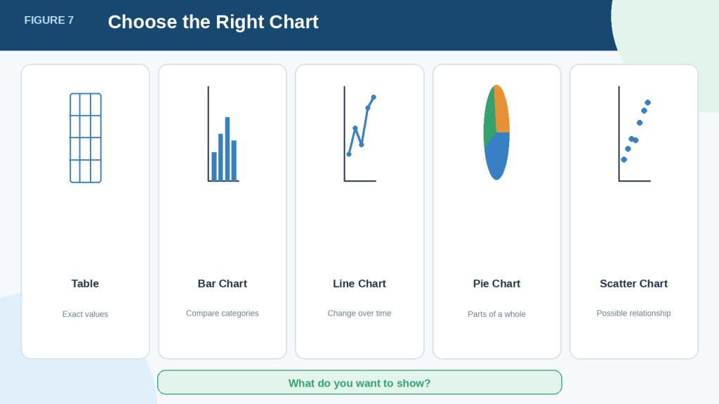
Figure 7. The correct chart type depends on the question the document data should answer.
Bar charts compare categories, line charts show changes over time, pie charts show parts of one total, and scatter charts explore possible relationships between two numerical values. A table remains the better choice when readers need exact details instead of a visual summary.
How to Create a Chart from a Verified Table
Create the chart only after checking the table against the original document. A chart based on incorrect or incomplete data will also be incorrect.
Step 1: Confirm Which Table to Use
When several tables appear in the conversation, identify the correct one clearly.
Example prompt:
Use the corrected monthly sales table shown in your previous response. Do not use the earlier draft table.
You may also paste the final table into a new message if there is any risk of confusion.
Step 2: State the Purpose of the Chart
Explain what the chart should help readers understand.
For example:
Create a chart that makes it easy to see how sales changed from January to December.
A clear purpose helps ChatGPT select an appropriate chart and avoid including unnecessary information.
Step 3: Name the Chart Type
You can allow ChatGPT to recommend a chart or request a specific type.
For example:
Create a line chart from the verified table because the data shows monthly changes over time.
ChatGPT can create static charts, and some charts may also be available in an interactive format. Interactive chart support includes bar, line, pie, and scatter charts. Other chart types may be provided as static images. Available options may vary by model, plan, workspace, and update.
Step 4: Identify the Data for Each Axis
Most bar, line, and scatter charts use two axes:
· The horizontal axis, also called the x-axis
· The vertical axis, also called the y-axis
Tell ChatGPT which information belongs on each axis.
Example prompt:
Place Month on the horizontal axis and Sales in dollars on the vertical axis.
For a horizontal bar chart, you may instead place category names on the vertical axis and numerical values on the horizontal axis.
Step 5: Request Clear Labels
A chart should include:
· A descriptive title
· Clear axis labels
· Units such as dollars, percentages, people, or kilograms
· Readable category or date labels
· A legend when more than one data series is shown
· Source information when appropriate
Example prompt:
Title the chart “Monthly Sales in 2026.” Label the horizontal axis “Month” and the vertical axis “Sales in Dollars.” Show the value for each month.
Avoid vague titles such as “Results” or “Chart 1.”
Step 6: Set the Correct Order
Dates and ordered categories should appear in the correct sequence.
Example prompt:
Keep the months in chronological order from January to December. Do not sort them alphabetically or by sales value.
For ranked comparisons, you may ask ChatGPT to sort values from highest to lowest.
Step 7: Tell ChatGPT Not to Add Missing Values
Repeat the instruction not to estimate or invent information.
Example prompt:
Use only values in the verified table. Do not estimate missing values, replace them with zero, or add outside information. Clearly mark any missing period.
A missing value and a value of zero do not mean the same thing.
Complete Example Prompt
Use the corrected monthly sales table from the previous response. Create a line chart showing how sales changed from January to December 2026. Place Month on the horizontal axis and Sales in dollars on the vertical axis. Keep the months in chronological order. Title the chart “Monthly Sales in 2026.” Show the value for each month. Use only values in the verified table. Do not estimate missing values or add outside information.
Step 8: Review the Chart
Check the chart before using it.
Confirm that:
· Every value matches the verified table.
· The title accurately describes the information.
· The axes are correctly labelled.
· Units are included.
· Dates and categories are in the correct order.
· Missing values are shown honestly.
· The scale does not exaggerate small differences.
· Colours and labels are easy to distinguish.
· The chart type suits the information.
· The chart does not suggest a conclusion unsupported by the document.
ChatGPT may select an analysis method or chart type that does not match your intention on the first attempt, so you may need to request corrections.
Step 9: Request Corrections When Needed
You do not need to recreate the chart from the beginning.
Example correction prompts include:
Change this bar chart to a line chart. Keep all values unchanged.
Add the missing axis labels and include dollars as the unit.
Put the months in chronological order without changing the sales values.
Remove the three-dimensional effect and use a simple two-dimensional chart.
Start the vertical axis at zero because the current scale exaggerates the differences.
Increase the label size so the chart is easier to read.
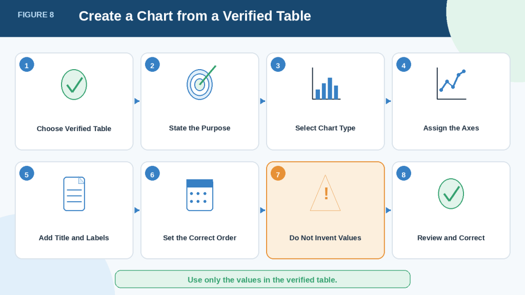
Figure 8. A reliable chart should be created from a verified table using clear instructions for its purpose, type, labels, order, and values.
ChatGPT needs more than a general request to create a useful chart. Identifying the verified data, chart purpose, axes, labels, units, and correct order helps reduce confusion. The completed chart must still be compared with the table and original document before it is shared or published.
Practical Example: Create an Expense Table and Bar Chart
A practical example can make the process easier to understand.
Imagine that a business report contains the following paragraph:
During the first quarter of 2026, the business spent $2,400 on rent, $650 on utilities, $900 on transportation, $1,200 on advertising, and $450 on office supplies.
The information is written as a paragraph, but the repeated categories and numerical values make it suitable for a table and chart.
Step 1: Ask ChatGPT to Extract the Information
Use a prompt such as:
Read the paragraph and extract each expense category and amount. Create a table with the columns Expense Category and Amount. Use only the values stated in the paragraph. Do not calculate or add any other expenses.
ChatGPT may create the following table:
| Expense Category | Amount |
| Rent | $2,400 |
| Utilities | $650 |
| Transportation | $900 |
| Advertising | $1,200 |
| Office Supplies | $450 |
Step 2: Verify the Table
Compare every row with the original paragraph.
Check that:
· Every category was included.
· Every amount was copied correctly.
· No extra category was added.
· The currency was preserved.
· The category names match the source.
In this example, the table matches the paragraph.
Step 3: Ask ChatGPT to Create the Chart
A bar chart is suitable because the purpose is to compare separate expense categories.
Use a prompt such as:
Create a bar chart from the verified expense table. Place the expense categories on the horizontal axis and the amounts in dollars on the vertical axis. Title the chart “First-Quarter Business Expenses.” Show the amount for each category. Use only the values in the table.
Step 4: Review What the Chart Shows
The chart should make it easy to see that:
· Rent was the largest expense.
· Advertising was the second-largest expense.
· Office supplies were the smallest expense.
· Utilities and transportation were lower than rent and advertising.
These observations are supported directly by the values in the table.
Step 5: Avoid Adding Unsupported Conclusions
The chart does not explain why rent was the largest expense or whether the business spent too much on advertising.
Those conclusions would require additional information, such as:
· The business budget
· Earlier expense reports
· Industry comparisons
· Revenue figures
· Explanations from the business owner
Reality: A chart can show what happened in the document data, but it does not automatically explain why it happened.
Improved Complete Prompt
Read the uploaded business report and find all first-quarter expense categories and amounts. Create a table with the columns Expense Category, Amount, and Source Location. Use only information stated in the report. Do not estimate missing values or add outside information. After I verify the table, create a bar chart titled “First-Quarter Business Expenses.” Place the categories on the horizontal axis and amounts in dollars on the vertical axis. Show the amount for each category and keep all values unchanged.
This prompt separates extraction, verification, and chart creation into clear stages.
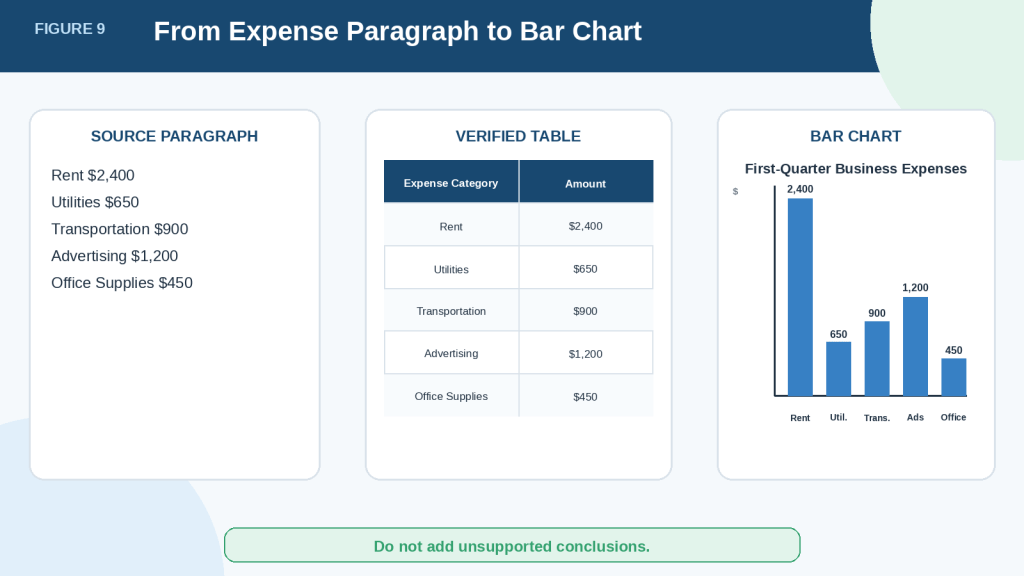
Figure 9. A document paragraph can be converted into a verified table and then presented as a bar chart.
The paragraph contains the original information, the table organizes the exact values, and the bar chart makes the differences between expense categories easier to compare. Each stage should use the same verified data without adding assumptions or unsupported conclusions.
Practical Example: Create a Monthly Sales Table and Line Chart
A line chart is useful when a document contains values recorded in chronological order, such as daily, weekly, monthly, quarterly, or yearly results.
Imagine that a sales report contains the following paragraph:
Sales were $8,200 in January, $8,750 in February, $8,400 in March, $9,100 in April, $9,650 in May, and $10,200 in June 2026.
The values are arranged by month, making them suitable for a table and line chart.
Step 1: Extract the Monthly Values
Use a prompt such as:
Read the paragraph and extract every month and its sales amount. Create a table with the columns Month and Sales. Keep the months in chronological order. Use only the values stated in the paragraph.
ChatGPT may create the following table:
| Month | Sales |
| January | $8,200 |
| February | $8,750 |
| March | $8,400 |
| April | $9,100 |
| May | $9,650 |
| June | $10,200 |
Step 2: Verify the Table
Compare the table with the original paragraph.
Confirm that:
· All six months are included.
· The months appear in chronological order.
· Every sales amount is correct.
· The currency has been preserved.
· No missing month has been added.
· No value has been estimated.
In this example, sales decreased slightly from February to March before increasing from April through June.
Step 3: Request a Line Chart
Use a prompt such as:
Create a line chart from the verified monthly sales table. Place Month on the horizontal axis and Sales in dollars on the vertical axis. Keep the months in chronological order from January to June. Title the chart “Monthly Sales: January to June 2026.” Show the value for each month. Use only the values in the table.
Step 4: Check the Vertical Scale
The vertical axis should present the values fairly.
A chart that begins very close to the lowest sales value may make small changes appear much larger than they really are.
For example, sales increased from $8,200 in January to $10,200 in June. This is a noticeable increase, but an extremely narrow vertical scale could make the difference look dramatic.
Ask ChatGPT:
Review the vertical-axis scale and confirm whether it gives a fair visual representation of the changes. Explain whether starting the scale at zero would improve clarity.
Starting at zero is often useful for bar charts. Line charts sometimes use a narrower scale to show changes more clearly, but the scale must be labelled honestly and should not mislead readers.
Step 5: Describe Only What the Data Supports
The table and chart support observations such as:
· February sales were higher than January sales.
· March sales were lower than February sales.
· Sales increased each month from March through June.
· June had the highest sales value in the period.
The chart does not prove what caused these changes.
It would be unsupported to claim that sales increased because of advertising, seasonal demand, better customer service, or a new product unless the document provides evidence.
How to Avoid This Mistake: Separate visible data patterns from possible explanations. Use phrases such as “The chart shows” for confirmed patterns and “The document does not explain” when the reason is unknown.
Complete Example Prompt
Read the uploaded report and identify monthly sales from January through June 2026. Create a table with the columns Month, Sales, and Source Location. Keep the months in chronological order. Use only values stated in the report and do not estimate missing amounts. After I verify the table, create a line chart titled “Monthly Sales: January to June 2026.” Place Month on the horizontal axis and Sales in dollars on the vertical axis. Show every monthly value and use a fair, clearly labelled scale. Describe the visible trend without guessing what caused it.
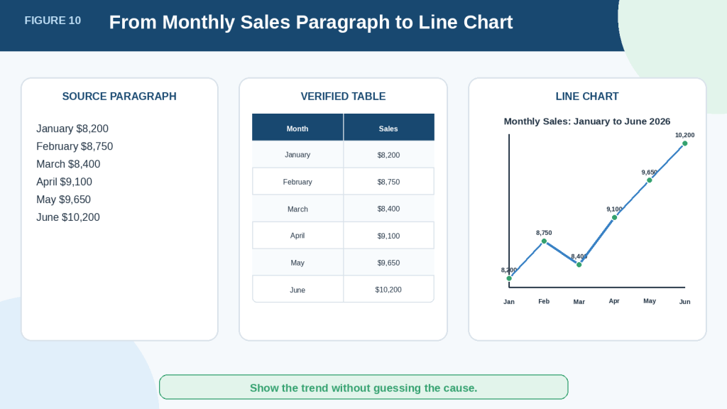
Figure 10. Monthly values can be organized into a verified table and displayed as a line chart to show change over time.
The table provides the exact monthly sales values, while the line chart makes the rise, fall, and overall direction easier to notice. The visual pattern can be described, but the reason for the changes should not be guessed unless the original document provides supporting evidence.
Practical Example: Create a Survey Table and Pie Chart
A pie chart can be useful when the values represent parts of one complete total.
Imagine that a customer survey report contains the following paragraph:
Out of 200 responses, 90 customers selected Very Satisfied, 60 selected Satisfied, 30 selected Neutral, 15 selected Dissatisfied, and 5 selected Very Dissatisfied.
These categories form one complete set of survey responses, so they may be suitable for a table and pie chart.
Step 1: Extract the Survey Results
Use a prompt such as:
Read the paragraph and extract each survey response category and number of responses. Create a table with the columns Response Category and Number of Responses. Use only the values stated in the paragraph.
ChatGPT may create the following table:
| Response Category | Number of Responses |
| Very Satisfied | 90 |
| Satisfied | 60 |
| Neutral | 30 |
| Dissatisfied | 15 |
| Very Dissatisfied | 5 |
Step 2: Check the Total
Before creating the chart, confirm that the values add up to the stated total.
In this example:
90 + 60 + 30 + 15 + 5 = 200
The table matches the 200 responses stated in the document.
Ask ChatGPT to show the calculation clearly:
Add the response counts and confirm whether they equal the stated total of 200. Do not change any value.
If the total does not match, do not create the pie chart until you identify the problem.
Step 3: Calculate the Percentages
A pie chart often displays percentages instead of only response counts.
Use a prompt such as:
Add a Percentage column. Calculate each category as a percentage of the total 200 responses. Show the calculation method and round percentages to one decimal place only if needed.
The completed table may look like this:
| Response Category | Number of Responses | Percentage |
| Very Satisfied | 90 | 45% |
| Satisfied | 60 | 30% |
| Neutral | 30 | 15% |
| Dissatisfied | 15 | 7.5% |
| Very Dissatisfied | 5 | 2.5% |
| Total | 200 | 100% |
Check the calculations before creating the chart.
Step 4: Request a Pie Chart
Use a prompt such as:
Create a pie chart from the verified survey table. Title the chart “Customer Satisfaction Survey Results.” Show the response category and percentage for each section. Use only the verified values and make sure the percentages total 100%.
Step 5: Decide Whether a Pie Chart Is Easy to Read
A pie chart works best when there are only a few categories and the differences are clear.
In this example, the smallest sections may be difficult to compare because Dissatisfied and Very Dissatisfied represent only small portions of the total.
A horizontal bar chart may be easier to read when:
· There are many response categories.
· Several values are close together.
· Small categories are difficult to see.
· Exact comparisons matter more than showing parts of a total.
You may ask ChatGPT:
Compare a pie chart and horizontal bar chart for this survey. Recommend which one is easier to read and explain why.
Step 6: Avoid Hiding Small Categories
Do not combine small categories into “Other” unless there is a clear reason and the change is disclosed.
Combining Dissatisfied and Very Dissatisfied would remove an important difference between the two responses.
How to Avoid This Mistake: Preserve the original survey categories unless the document or project requires grouping. If categories are combined, explain exactly which categories were grouped and why.
Complete Example Prompt
Read the uploaded survey report and extract every customer satisfaction category and response count. Create a table with the columns Response Category, Number of Responses, Percentage, and Source Location. Confirm that the response counts equal the stated total before calculating percentages. Do not estimate missing values. After I verify the table, create a pie chart titled “Customer Satisfaction Survey Results.” Show each category name and percentage, confirm that the percentages total 100%, and do not combine any categories without my approval.
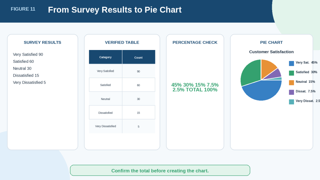
Figure 11. Survey responses can be organized into a verified table, converted into percentages, and displayed as parts of one total.
The response counts should first be checked against the stated total. After the values and percentages are verified, a pie chart can show how the total is divided among the survey categories. A bar chart may still be clearer when small sections are difficult to compare.
How to Improve and Correct a Chart
The first chart may need changes before it is ready to use. You can ask ChatGPT to improve its labels, scale, order, layout, and readability without changing the verified data.
Improve the Chart Title
The title should explain exactly what the chart shows.
Avoid vague titles such as:
· Results
· Data Chart
· Monthly Information
· Report Figures
Use a descriptive title such as:
· Monthly Sales: January to June 2026
· First-Quarter Business Expenses
· Customer Satisfaction Survey Results
· Project Tasks Completed by Department
Example prompt:
Change the chart title to “Monthly Sales: January to June 2026.” Do not change the data.
Add Clear Axis Labels and Units
Readers should not have to guess what the axes represent.
A chart may require labels such as:
· Month
· Expense Category
· Number of Responses
· Sales in Dollars
· Percentage
· Number of Customers
· Average Test Score
Example prompt:
Label the horizontal axis “Month” and the vertical axis “Sales in Dollars.” Keep all values unchanged.
Units are especially important when values could represent dollars, percentages, people, hours, kilograms, or other measurements.
Correct the Category Order
ChatGPT may arrange categories alphabetically or by value when a different order is needed.
For time-based information, use chronological order:
Arrange the months from January through December. Do not sort them alphabetically or by sales amount.
For ranked comparisons, use highest-to-lowest order:
Sort the expense categories from the highest amount to the lowest. Keep every value unchanged.
For survey scales, preserve their logical order:
1st Very Satisfied
2nd Satisfied
3rd Neutral
4th Dissatisfied
5th Very Dissatisfied
Check the Chart Scale
The scale can affect how readers understand the differences.
A bar chart with a vertical axis starting far above zero can make small differences appear much larger than they are. A line chart may sometimes use a narrower scale to show changes, but the scale must remain clear and honest.
Example prompt:
Review the chart scale for possible exaggeration. Create a revised version with a clearly labelled scale that represents the differences fairly. Do not change the data.
Do not assume that every chart must use the same scale. Consider the chart type, purpose, and values.
Remove Misleading Visual Effects
Three-dimensional effects, tilted charts, shadows, decorative pictures, and oversized symbols can distract readers or distort comparisons.
Use a simple two-dimensional design when accuracy is more important than decoration.
Example prompt:
Remove all three-dimensional effects and decorative elements. Use a simple two-dimensional chart with clear labels and unchanged values.
Make Labels Easier to Read
Long category names may overlap, become too small, or be cut off.
You may ask ChatGPT to:
· Use a horizontal bar chart.
· Shorten labels without changing their meaning.
· Wrap long labels onto two lines.
· Increase the text size.
· Display fewer date labels.
· Move the legend to a clearer position.
Example prompt:
Change the chart to a horizontal bar chart so that every category name is fully readable. Keep all categories and values unchanged.
Use Colours Carefully
Colours can help separate categories or data series, but colour should not be the only way information is communicated.
The chart should also use:
· Direct labels
· Different line styles
· Different marker shapes
· Patterns when suitable
· A clear legend
Avoid using colours that are too similar or combinations that may be difficult for some readers to distinguish.
Example prompt:
Improve the chart’s accessibility. Use clearly distinguishable categories, direct labels, and a readable legend. Do not rely only on colour to communicate differences.
Add Data Labels Only When Helpful
Data labels show exact values beside bars, lines, points, or pie sections.
They can be useful when readers need exact figures. However, too many labels may make a chart crowded.
Example prompt:
Add the value above each bar. Keep the labels large enough to read and avoid overlapping text.
For a chart with many points, it may be better to show only selected labels and provide the full data in a table.
Preserve the Verified Data
After every chart correction, compare the revised chart with the verified table.
Confirm that ChatGPT has not:
· Changed any value
· Removed a category
· Added a missing period
· Rounded numbers incorrectly
· Changed a percentage
· Reordered information improperly
· Replaced a missing value with zero
· Altered the measurement unit
How to Avoid This Mistake: Include the instruction “Change only the chart presentation. Do not change, calculate, remove, combine, or add any data.”
Complete Chart-Improvement Prompt
Improve this chart without changing the verified data. Use the title “First-Quarter Business Expenses.” Label the horizontal axis “Expense Category” and the vertical axis “Amount in Dollars.” Arrange the categories from highest to lowest. Use a simple two-dimensional bar chart, remove decorative effects, display each amount clearly, and make all labels easy to read. Change only the presentation. Do not change, calculate, remove, combine, or add any data.
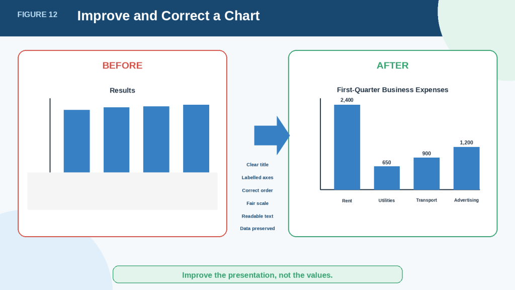
Figure 12. A chart can be made clearer and more accessible without changing its verified values.
Improving a chart should focus on presentation, including its title, labels, order, scale, readability, and accessibility. Every revised chart must still match the verified table so that visual changes do not alter or misrepresent the original document information.
How to Save and Use Tables and Charts
After verifying the results, you may want to save the table or chart for use in a spreadsheet, report, presentation, website, or other document.
The available buttons and file options may vary depending on your ChatGPT plan, device, model, workspace settings, and future updates.
Download a Table
When ChatGPT displays a downloadable table, look for the Download button near the upper-right corner of the table.
Tables downloaded from ChatGPT’s data-analysis interface are normally saved as CSV files. CSV stands for comma-separated values. It is a simple file format that stores table information in rows and columns.
A CSV file can usually be opened with programs such as:
· Microsoft Excel
· SoftMaker PlanMaker
· Google Sheets
· LibreOffice Calc
· Other spreadsheet programs
After opening the file, check that:
· The headings are correct.
· Every row is included.
· Dates display properly.
· Currency symbols are preserved.
· Percentages have not changed.
· Special characters appear correctly.
· Long numbers have not been shortened or converted.
Spreadsheet software may automatically change dates, identification numbers, or other values. Compare the opened file with the verified ChatGPT table.
Copy a Table into Another Document
You may also select and copy a table directly from the conversation.
When pasting it into TextMaker, WordPress, an email, or another program, the formatting may change. Columns may become uneven, borders may disappear, or the information may be pasted as plain text.
After pasting, check:
· Column alignment
· Heading formatting
· Number alignment
· Table width
· Spacing
· Borders
· Mobile readability
For WordPress, use a Table block rather than trying to align information with spaces. In the WordPress editor, select the Add block button, search for Table, choose the number of columns and rows, and paste or enter the verified information. Button names may vary by WordPress plan, editor, or update.
Download a Chart
When a chart has a download option, look near its upper-right corner.
Downloaded charts are normally saved as PNG image files. Some charts may also include controls for expanding the chart, changing its colours, or turning interactivity on or off.
Before downloading, make sure the chart includes:
· The final approved title
· Correct axis labels
· Measurement units
· Readable categories
· A legend when needed
· Verified values
· A fair scale
· Accessible colour and label choices
Download the chart again after making corrections. Do not accidentally use an earlier version that contains errors.
Rename the Downloaded Files
Use descriptive filenames instead of leaving unclear automatic names.
Examples include:
· monthly-sales-january-to-june-2026.csv
· monthly-sales-line-chart-2026.png
· first-quarter-business-expenses.csv
· first-quarter-expenses-bar-chart.png
· customer-satisfaction-survey-results.csv
· customer-satisfaction-pie-chart.png
Clear filenames make the files easier to identify, organize, and reuse.
Keep the Source Files and Creation Records
Save the following items together:
· Original document
· Original prompt
· Verified table
· Downloaded CSV file
· Final chart
· Corrected versions
· Source references
· Permission or licence records when relevant
· Publication date and location
Use separate filenames or version numbers when making corrections.
For example:
· monthly-sales-table-v1.csv
· monthly-sales-table-verified-v2.csv
· monthly-sales-chart-final.png
This prevents an unverified draft from being confused with the approved version.
Add Context When Publishing a Chart
A chart should not appear without enough information for readers to understand it.
Include:
· A clear caption
· A short explanation
· The covered time period
· The measurement unit
· The source document
· Any important missing information
· Any calculations or category changes
· An accessibility description or alt text
For example:
Caption: Monthly sales from January through June 2026.
Explanation: Sales decreased slightly in March and then increased each month through June. The chart shows the pattern but does not explain what caused the changes.
Alt text: Line chart showing monthly sales of $8,200 in January, $8,750 in February, $8,400 in March, $9,100 in April, $9,650 in May, and $10,200 in June 2026.
Alt text should communicate the chart’s main information to readers who cannot see the image. Important values should also be available in nearby text or a table whenever practical.
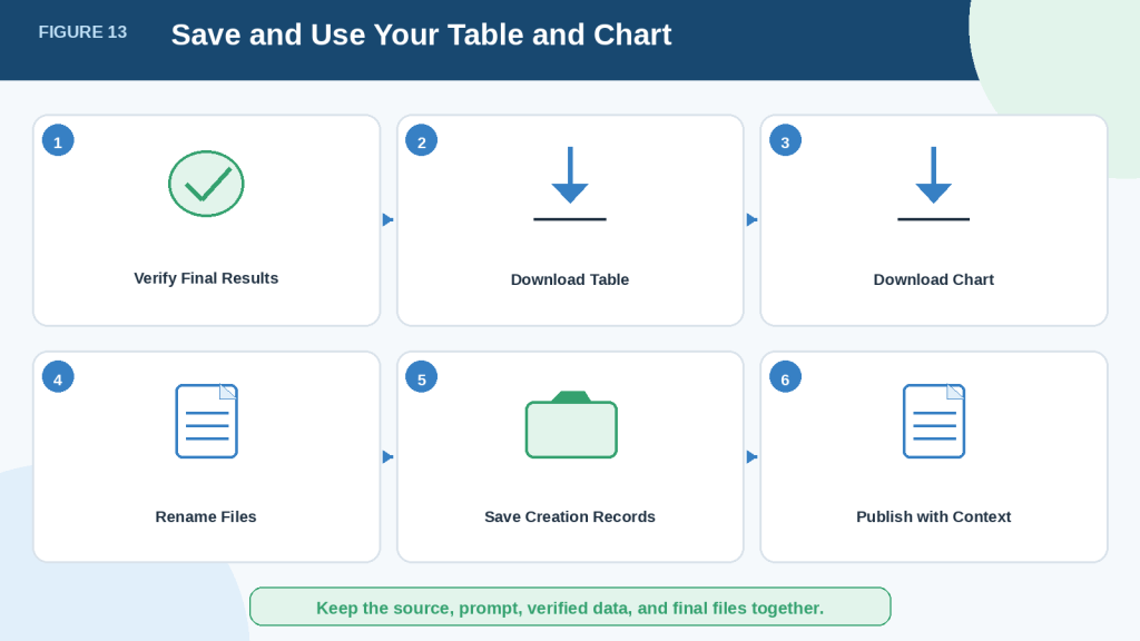
Figure 13. Verified tables and charts should be downloaded, clearly named, organized, and published with enough context for readers.
Saving the original document, prompt, verified data, and final chart creates a useful record of how the visual was produced. Clear filenames, captions, explanations, sources, and accessibility information make the final result easier to understand, verify, and manage.
Benefits of Creating Tables and Charts from Documents with ChatGPT
ChatGPT can make document information easier to organize, compare, and explain. These benefits are most useful when the original document contains clear and verifiable information.
Organizes Scattered Information
Important details may appear across several pages, paragraphs, sections, or tables.
ChatGPT can bring related information together into one organized table. This can reduce the time spent searching through a long document for names, dates, amounts, categories, or results.
For example, a project report may mention deadlines in several sections. ChatGPT can collect those deadlines into one table for easier review.
Makes Comparisons Easier
Rows and columns allow readers to compare information side by side.
A table can make it easier to identify:
· The highest and lowest values
· Missing information
· Repeated categories
· Differences between products
· Changes between reporting periods
· Tasks with different deadlines or statuses
A chart can make some of these differences visible more quickly.
Helps Reveal Patterns and Trends
Charts can help readers notice patterns that may be difficult to see in paragraphs or long number lists.
For example, a line chart may show:
· A steady increase
· A gradual decrease
· A sudden change
· A repeated rise and fall
· A period with missing information
The chart can reveal the pattern, but the original document is still needed to understand its meaning and possible causes.
Converts Text into a More Usable Format
Information written in sentences may be difficult to copy into a spreadsheet, report, or presentation.
ChatGPT can help convert suitable text into:
· Tables
· Lists of categories
· Chronological records
· Comparison summaries
· Chart-ready numerical data
This can provide a useful starting point for further review or formatting.
Allows Quick Revisions
You can ask ChatGPT to change the presentation without manually rebuilding the entire table or chart.
For example, you can request:
· Different column headings
· A new row order
· Consistent date formats
· A bar chart instead of a pie chart
· Larger labels
· A clearer title
· A simpler layout
The verified source values should remain unchanged during these revisions.
Supports Different Levels of Detail
You may create more than one version for different readers.
For example:
· A detailed table for checking exact values
· A simplified table for a general audience
· A chart for a presentation
· A written summary for readers who prefer text
This makes the same verified information easier to use in different situations.
Helps Identify Possible Data Problems
ChatGPT may help point out:
· Missing values
· Duplicate records
· Inconsistent labels
· Conflicting totals
· Unusual entries
· Percentages that do not add up correctly
These findings are useful warnings, not final proof of an error. Every suspected problem should be checked against the original document.
Improves Communication
A well-designed table or chart can make complicated information easier to explain to beginners, customers, colleagues, students, or website readers.
Clear visuals can support reports, lessons, presentations, planning documents, and WordPress articles.
However, the visual should always include enough context to prevent misunderstanding.
Reality: ChatGPT can speed up organization and presentation, but it does not remove the need for human review. The original document remains the main source of truth.
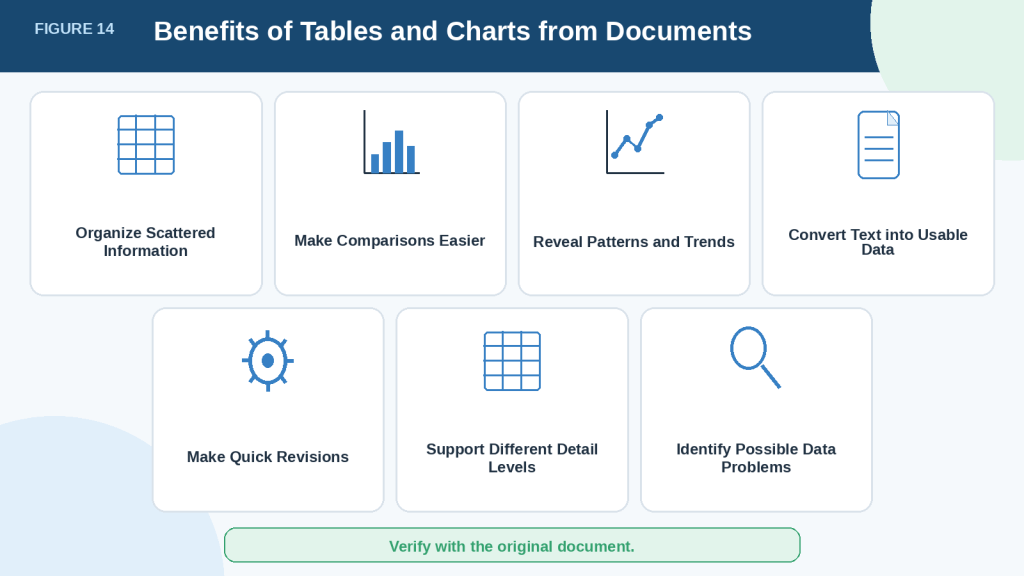
Figure 14. ChatGPT can make document information easier to organize, compare, revise, and communicate.
Tables and charts can save time and make complex information easier to understand, but their usefulness depends on the quality of the original document and the accuracy of the extracted data. Human verification remains necessary before the results are used, shared, or published.
Limitations of Creating Tables and Charts from Documents with ChatGPT
ChatGPT can organize document information quickly, but its results may be incomplete, inaccurate, or misleading. A professional-looking table or chart should never be accepted as correct without checking it against the original document.
ChatGPT May Extract Values Incorrectly
ChatGPT may copy information incorrectly when creating a table.
Possible errors include:
· Misreading a number
· Removing a decimal point
· Changing a negative value into a positive value
· Placing a value in the wrong row
· Confusing similar categories
· Misreading a date
· Using the wrong currency
· Changing a measurement unit
A single extraction error can affect totals, averages, percentages, rankings, and every chart created from the table.
How to Reduce This Limitation: Compare every table row with the original document. Pay special attention to totals, unusually high or low values, negative numbers, decimal points, dates, currencies, and measurement units.
Scanned and Image-Based Documents May Be Difficult to Read
ChatGPT may not reliably extract exact values from:
· Scanned PDFs
· Photographs of tables
· Blurred pages
· Handwritten documents
· Image-based tables
· Documents with complicated visual layouts
· Tables with merged or overlapping cells
OpenAI advises using a spreadsheet or text-based file when exact values are important because image-based tables and scanned files may not be read reliably.
Possible problems include:
· Missing rows
· Incorrect column boundaries
· Confused headings
· Values taken from the wrong section
· Unreadable notes or footnotes
· Tables processed in the wrong order
Some PDF visual-reading features also depend on the user’s plan and how the file is uploaded. OpenAI states that embedded images in many document uploads may not be processed in the same way as digital text.
How to Reduce This Limitation: Use a clear text-based PDF, DOCX file, CSV file, or spreadsheet whenever possible. When using a scanned document, provide the clearest available copy and verify every extracted value carefully.
ChatGPT May Not Review the Complete File
A file may upload successfully without every page, row, column, sheet, appendix, or footnote being included in the analysis.
This can happen when the file is:
· Very long
· Image-heavy
· Poorly organized
· Complicated
· Too large for the available analysis context
· Divided into many sheets or sections
OpenAI recommends asking ChatGPT to inspect specific sheets, rows, columns, pages, or sections when a result appears incomplete. A difficult file can also be divided into smaller files for separate analysis.
How to Reduce This Limitation: Process a large document in smaller sections. Ask ChatGPT to confirm which pages, sheets, sections, or date ranges it reviewed before extracting the information.
Example prompt:
Review pages 1 through 10 only. List the headings, tables, and data categories you found before extracting any values.
ChatGPT May Select the Wrong Information
A document may contain several sets of similar information.
For example, a sales report may include:
· Monthly sales
· Quarterly sales
· Projected sales
· Actual sales
· Sales before tax
· Sales after refunds
· Sales before returns
· Sales after returns
ChatGPT may select information that appears relevant but does not answer your intended question.
A chart created from the wrong data may still look convincing.
How to Reduce This Limitation: Identify the exact section, table, category, time period, and measurement you want ChatGPT to use. Ask it to create the table first and wait for your approval before creating the chart.
Example prompt:
Use only the actual monthly sales after refunds from the section titled “Final Sales Results.” Do not use projected sales or quarterly totals.
Calculations May Be Incorrect
ChatGPT may make mistakes when calculating:
· Totals
· Averages
· Percentages
· Percentage changes
· Ratios
· Differences
· Rankings
· Running totals
For example, a pie chart may look complete even when its percentages do not total 100%.
How to Reduce This Limitation: Ask ChatGPT to show the formula and calculation steps. Check important calculations with a calculator or spreadsheet program before using or publishing the result.
Example prompt:
Show the formula used for every percentage. Confirm that the percentages total 100%. Do not change the original values.
Missing Information May Be Treated as Zero
A blank cell does not always mean zero.
It may mean:
· Not reported
· Not available
· Not applicable
· Not measured
· Accidentally omitted
· Still being collected
· Unclear in the source document
Replacing missing information with zero can change totals, averages, percentages, and chart trends.
For example, no reported sales figure is not necessarily the same as sales of $0.
How to Reduce This Limitation: Tell ChatGPT to label missing information as “Not provided,” “Not available,” or another appropriate description. Do not allow it to replace missing values with zero unless the original document clearly states that the value is zero.
ChatGPT May Recommend the Wrong Chart Type
ChatGPT may select a chart that does not match your purpose.
OpenAI states that ChatGPT may choose an analysis method or chart type that differs from the user’s intention. Users can request a specific chart type, data grouping, column, or analysis method when needed.
Possible problems include:
· Using a pie chart with too many categories
· Using a line chart for unrelated categories
· Using a bar chart when a table would be clearer
· Comparing values that do not belong together
· Showing too many data series in one chart
· Using a chart when the document contains too little data
How to Reduce This Limitation: Ask ChatGPT to recommend a chart and explain its choice before creating it. Consider whether the chart clearly answers the intended question.
Example prompt:
Recommend the most suitable chart for this verified table. Explain what the chart would show, why it is appropriate, and any limitations. Do not create the chart until I approve your recommendation.
A Chart Can Exaggerate Differences
A chart can use correct values and still create a misleading impression.
Possible problems include:
· A vertical axis that begins far above zero
· Unequal scale intervals
· Incorrect date order
· Oversized symbols
· Different bar widths
· Three-dimensional effects
· Missing labels
· Similar or confusing colours
· Important categories hidden in a legend
· Values displayed without their units
For example, a shortened vertical axis may make a small increase appear dramatic.
How to Reduce This Limitation: Check the chart’s scale, intervals, category order, labels, units, bar sizes, and overall design. Use a simple two-dimensional chart and keep the verified table available for comparison.
Charts Do Not Explain Why Something Happened
A chart may show that:
· Sales increased.
· Expenses decreased.
· Survey responses changed.
· Website visits fell.
· Project progress slowed.
However, the chart does not automatically explain the cause.
Possible explanations may include advertising, seasonal demand, pricing changes, economic conditions, missing records, or changes in how the information was collected. These explanations should not be presented as facts unless the document provides supporting evidence.
How to Reduce This Limitation: Separate confirmed patterns from possible explanations.
Use wording such as:
The chart shows that sales increased from April through June. The document does not explain what caused the increase.
Tables and Charts Can Remove Important Context
Turning document text into rows, columns, and chart points may remove important information from nearby paragraphs, headings, definitions, notes, or footnotes.
A reported value may be:
· An estimate
· Preliminary
· Based on a small sample
· Excluding certain categories
· Calculated using a special method
· Subject to later revision
· Limited to a particular location or time period
Removing this information may cause readers to misunderstand the result.
How to Reduce This Limitation: Review the text surrounding each value. Add a Notes, Source, or Limitations column when important conditions apply.
Example prompt:
Add a Notes column containing any warning, exception, estimate, definition, or limitation connected to each value. Do not remove the original wording’s meaning.
Downloaded Files May Change in Other Programs
A downloaded table may display differently when opened in spreadsheet or document software.
For example:
· Dates may change format.
· Long numbers may be shortened.
· Leading zeros may disappear.
· Percentages may be converted.
· Currency symbols may change.
· Special characters may display incorrectly.
· Columns may become too narrow.
A chart image may also become difficult to read after it is resized, compressed, copied into TextMaker, or displayed on a small mobile screen.
How to Reduce This Limitation: Open every downloaded file and compare it with the verified version in ChatGPT. Check it again after placing it in TextMaker, WordPress, a presentation, or another program.
Accessibility May Be Incomplete
A chart may be difficult to understand for readers with visual impairments or colour-vision differences.
Possible accessibility problems include:
· Tiny text
· Low colour contrast
· Information shown only through colour
· Missing alt text
· Missing chart explanation
· No nearby data table
· Crowded labels
· Unexplained abbreviations
· Labels that are cut off on mobile screens
How to Reduce This Limitation: Use large readable labels, sufficient contrast, direct data labels, clear legends, descriptive alt text, and a nearby table or written summary containing the important values.
File Support, Features, and Limits May Change
ChatGPT currently supports many common document, spreadsheet, text, and presentation formats, including XLSX, XLS, CSV, TSV, DOCX, PPTX, PDF, and TXT. However, available file types and data-analysis features may vary by model, plan, workspace settings, and account capabilities.
Upload limits and file-handling rules may also vary or change.
How to Reduce This Limitation: Check current official OpenAI guidance:
· When using document analysis for the first time
· After changing your ChatGPT plan or model
· When a previously available feature behaves differently
· After receiving a product or policy update
· When working with an important or unusually large file
Readers do not need to reread every policy before every task. Periodic checking is usually enough unless something has changed.
Reality: A polished table or chart is not proof that its information is complete, accurate, or fairly presented. The original document, verified calculations, supporting context, and human judgment remain essential.
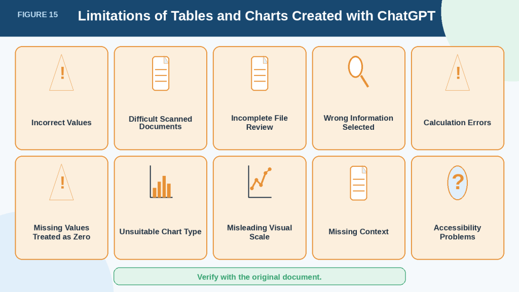
Figure 15. ChatGPT-created tables and charts may contain extraction, calculation, presentation, context, and accessibility problems.
A professional-looking table or chart may still contain incorrect values, missing information, calculation errors, or misleading design choices. Comparing the result with the original document and checking its calculations, context, chart design, and accessibility can reduce these risks before publication.
Common Mistakes When Creating Tables and Charts from Documents
Beginners often focus on producing a polished table or chart and forget to check whether the information is complete, accurate, and suitable for visual presentation.
Mistake 1: Asking for a Table Without Clear Instructions
A request such as:
Make a table from this document.
does not explain which information should be included, how the columns should be named, or how missing values should be handled.
ChatGPT may choose details that do not match your purpose.
How to Avoid This Mistake: Name the exact information, column headings, order, time period, and source section you want.
Example:
Extract the monthly sales totals from the section titled “2026 Sales Results.” Create a table with the columns Month, Sales, and Source Location. Keep the months in chronological order and mark missing values as “Not provided.”
Mistake 2: Creating the Chart Before Verifying the Table
A chart created from an incorrect table will repeat and sometimes magnify the same errors.
For example, one incorrect expense amount may change:
· The highest category
· The total
· The percentage share
· The bar height
· The written conclusion
How to Avoid This Mistake: Use a two-stage process:
1st Create and verify the table.
2nd Create the chart from the verified table.
Do not ask ChatGPT to extract, calculate, and create the final chart in one step when accuracy is important.
Mistake 3: Assuming Blank Cells Mean Zero
A missing value may mean that the information was not reported, not measured, or not available.
Replacing it with zero can create false totals and misleading trends.
How to Avoid This Mistake: Use instructions such as:
Do not replace missing information with zero. Mark it as “Not provided” and explain how the missing value affects the table or chart.
Mistake 4: Using the Wrong Chart Type
A pie chart may be chosen because it looks attractive even when the categories do not form one total.
A line chart may be used for unrelated categories even though the order has no meaning.
How to Avoid This Mistake: Decide what the visual should show:
· Exact values: use a table.
· Category comparison: use a bar chart.
· Change over time: use a line chart.
· Parts of one total: use a pie chart.
· Possible relationship between two numerical values: use a scatter chart.
Ask ChatGPT to explain its recommendation before creating the chart.
Mistake 5: Mixing Different Units
A document may include dollars, percentages, quantities, hours, and customer counts.
Placing these values on one chart without clear separation can confuse readers.
For example, comparing $5,000 in sales with 200 customers on the same vertical scale does not create a fair comparison.
How to Avoid This Mistake: Use separate charts or clearly labelled data series when measurements use different units. Include the unit in every heading and axis label.
Mistake 6: Combining Categories Without Approval
ChatGPT may combine small or similar categories to simplify a table or chart.
For example, it may group:
· Dissatisfied and Very Dissatisfied
· Travel and Transportation
· Advertising and Marketing
· Repairs and Maintenance
These terms may have different meanings in the original document.
How to Avoid This Mistake: Include this instruction:
Preserve every original category. Do not combine, rename, or remove categories without my approval.
Mistake 7: Ignoring Footnotes and Explanatory Text
Important conditions may appear outside the main table.
A footnote may explain that a value is:
· Estimated
· Preliminary
· Excluding tax
· Based on partial results
· Limited to one location
· Calculated using a different method
Removing this context may make the table or chart misleading.
How to Avoid This Mistake: Ask ChatGPT to include a Notes or Limitations column and review the paragraphs and footnotes surrounding each value.
Mistake 8: Trusting Calculated Percentages Automatically
A table may contain accurate response counts but incorrect percentages.
Rounding can also cause percentages to total slightly more or less than 100%.
How to Avoid This Mistake: Ask ChatGPT to show the formula, original value, total, and calculated percentage. Check the calculation with a calculator or spreadsheet program.
Mistake 9: Using a Misleading Scale
A chart may exaggerate a small difference when the vertical axis begins close to the lowest value.
Unequal intervals can also make the chart difficult to interpret.
How to Avoid This Mistake: Check where the scale begins and confirm that every interval represents an equal amount. For bar charts, starting at zero is generally the clearest approach.
Mistake 10: Using Too Many Categories or Data Series
A chart with many bars, lines, colours, labels, or legend entries can become harder to understand than the original table.
How to Avoid This Mistake: Keep the chart focused on one clear question. Use a table for detailed information and create separate charts for different comparisons when necessary.
Mistake 11: Describing Causes That the Data Does Not Prove
A chart may show that sales increased after March, but it does not prove that advertising caused the increase.
Other explanations may be possible, or the document may not explain the change at all.
How to Avoid This Mistake: Describe only the visible pattern.
Use:
Sales increased from March through June.
Avoid:
Advertising caused sales to increase.
unless the document provides reliable evidence for that conclusion.
Mistake 12: Publishing Without Accessibility Information
A chart image without alt text, a written summary, or a nearby table may be unusable for some readers.
Colour-only distinctions may also be difficult for readers with colour-vision differences.
How to Avoid This Mistake: Add:
· Descriptive alt text
· A clear caption
· A short explanation
· Readable labels
· Sufficient contrast
· A nearby table or written summary of important values
Mistake 13: Losing Track of the Final Version
A beginner may accidentally publish an early table or chart instead of the corrected version.
Files with names such as chart.png, chart-new.png, and chart-final-new2.png are easy to confuse.
How to Avoid This Mistake: Use clear versioned filenames, such as:
· monthly-sales-table-draft-v1.csv
· monthly-sales-table-verified-v2.csv
· monthly-sales-chart-final.png
Keep the original document, verified table, and final chart in the same organized folder.
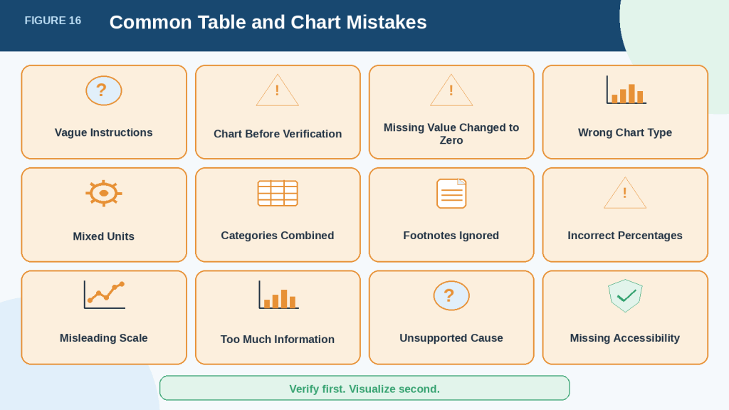
Figure 16. Common mistakes can make an accurate-looking table or chart incomplete, confusing, or misleading.
Most problems can be reduced by giving clear instructions, verifying the table before creating the chart, preserving the original categories and units, checking calculations and scales, and adding enough context and accessibility information for readers.
Common Myths About Creating Tables and Charts with ChatGPT
ChatGPT can create tables and charts that look clear and professional. However, a polished appearance does not guarantee that the information is accurate, complete, accessible, or ready to publish.
Understanding these common myths can help you review the results more carefully.
Myth 1: A Professional-Looking Chart Must Be Accurate
A chart with a clear title, neat colours, and attractive labels may appear reliable.
However, it may still contain:
· Incorrect values
· Missing categories
· Calculation errors
· Incorrect axis labels
· A misleading scale
· Information taken from the wrong part of the document
Reality: A well-designed chart can still contain incorrect data. Compare every important value with the verified table and original document.
Myth 2: ChatGPT Reviews Every Part of an Uploaded Document
Uploading a file successfully does not mean that ChatGPT reviewed every page, sheet, table, image, appendix, or footnote correctly.
Information may be missed in:
· Long documents
· Scanned pages
· Complicated layouts
· Appendices
· Footnotes
· Images containing text or numbers
· Spreadsheets with several sheets
· Tables with merged or unclear cells
Reality: Ask ChatGPT to identify which pages, sections, tables, or spreadsheet sheets it reviewed. Process long or complicated files in smaller sections when necessary.
Myth 3: ChatGPT Always Preserves the Original Values
ChatGPT may accidentally change information while extracting, sorting, calculating, or formatting it.
For example, it may:
· Change a decimal point
· Round a value
· Remove a negative sign
· Place a number in the wrong row
· Replace a missing value with zero
· Combine separate categories
· Change a date or unit
Reality: Check every important value after the table is created. Check the values again after calculations, sorting, or chart revisions.
Myth 4: ChatGPT Automatically Chooses the Best Chart
ChatGPT may create a chart that is technically possible but not suitable for the information or the intended purpose.
For example, it may use:
· A pie chart with too many sections
· A line chart for unrelated categories
· A crowded chart with several data series
· A chart when a table would be clearer
· A visual that does not answer the main question
Reality: The best chart depends on what readers need to understand. Ask ChatGPT to recommend a chart type and explain its choice before creating it.
Myth 5: A Missing Value Means Zero
A blank or missing value may mean:
· Not reported
· Not available
· Not applicable
· Not measured
· Still being collected
· Accidentally omitted
A value of zero means that the measured amount was actually zero.
These meanings are different.
Reality: Mark missing information clearly as “Not provided,” “Not available,” or another appropriate label. Do not replace it with zero unless the original document confirms that zero is correct.
Myth 6: A Chart Explains Why Something Happened
A chart can show that a value increased, decreased, remained steady, or changed unexpectedly.
However, it does not automatically explain the cause.
For example, an increase in sales might be connected to:
· Advertising
· Seasonal demand
· A price change
· A new product
· More customers
· Another factor not mentioned in the document
The chart alone cannot prove which explanation is correct.
Reality: Describe what the chart shows, but do not guess the cause. State clearly when the original document does not explain why the change occurred.
Myth 7: Percentages Created by ChatGPT Are Always Correct
Percentages may be incorrect because of:
· Calculation mistakes
· Missing categories
· Incorrect totals
· Duplicated values
· Incorrectly grouped categories
· Rounding
A pie chart may still look complete even when the percentages do not total 100%.
Reality: Check the original values, calculation formula, stated total, and final percentages before creating or publishing the chart.
Myth 8: Tables and Charts Replace the Original Document
Tables and charts can summarize information, but they may leave out important details.
Missing context may include:
· Definitions
· Warnings
· Exceptions
· Footnotes
· Explanations
· Calculation methods
· Research methods
· Limitations
A chart may show a number without explaining that it is an estimate, preliminary result, or partial total.
Reality: Use tables and charts as summaries. Keep the original document available so that important context and limitations can be checked.
Myth 9: ChatGPT-Created Charts Are Automatically Accessible
A chart may be difficult for some readers to understand when it contains:
· Small text
· Low colour contrast
· Information shown only through colour
· Crowded labels
· An unclear legend
· Missing alt text
· No nearby data table
· No written explanation
Reality: Accessibility must be added and reviewed. Include readable labels, sufficient contrast, direct descriptions, alt text, a caption, an explanation, and important values in a nearby table or paragraph.
Myth 10: A Downloaded Table or Chart Is Ready to Publish
Downloading a file does not guarantee that it is accurate, correctly formatted, or suitable for its final location.
Spreadsheet software may automatically change:
· Dates
· Percentages
· Long numbers
· Leading zeros
· Currency symbols
· Decimal places
Chart images may also become difficult to read after resizing, compressing, or displaying them on a mobile screen.
Reality: Open and review the downloaded file in the program where it will be used. Confirm that the values, labels, layout, scale, units, and accessibility information remain correct.
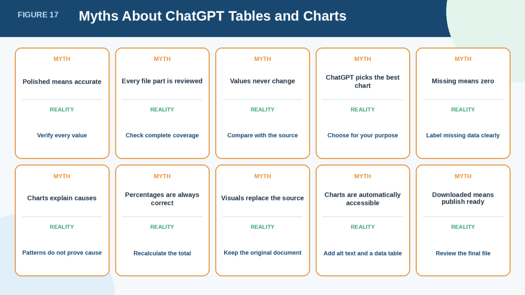
Figure 17. Common myths may cause beginners to trust ChatGPT-created tables and charts without checking their accuracy, context, calculations, and accessibility.
ChatGPT can help organize and visualize document information, but it does not guarantee that the result is complete, accurate, accessible, or correctly interpreted. The source document, verified data, and final presentation must always be reviewed before the table or chart is shared or published.
Privacy, Permission, Accessibility, and Responsible Use
Documents may contain personal, confidential, copyrighted, or sensitive information. Creating a table or chart does not remove your responsibility to protect that information and present it accurately.
Remove Private Information Before Uploading
Review the complete document before uploading it to ChatGPT.
Remove information that is not necessary for the task, including:
· Full names
· Home addresses
· Telephone numbers
· Personal email addresses
· Account numbers
· Identification numbers
· Passwords
· Medical details
· Employment records
· Customer information
· Confidential business information
· Private financial information
For example, a customer survey chart may require response categories and totals, but it probably does not require customers’ names, email addresses, or telephone numbers.
How to Protect Privacy: Create a separate working copy of the document and remove unnecessary personal information from that copy. Keep the original file unchanged in a secure location.
Check Your ChatGPT Data Controls
ChatGPT includes Data Controls that allow users to manage whether their conversations may be used to improve OpenAI’s models. For signed-in accounts, this setting can be reviewed under Profile icon → Settings → Data Controls → Improve the model for everyone. Turning this setting off does not automatically remove conversations from chat history.
Temporary Chat may provide an additional option for conversations that should not appear in chat history or create memories. OpenAI currently states that Temporary Chats are deleted from its systems after 30 days and are not used to train its models, although they may be reviewed for abuse monitoring. Policies and retention conditions may change.
Files uploaded to ChatGPT are handled according to the account’s settings, workspace rules, retention policy, and Data Controls. OpenAI states that files uploaded through individual ChatGPT services may be used to improve models when the relevant training setting is enabled. Business offerings use different default data-handling conditions.
Readers should check the current official settings:
· When uploading documents for the first time
· After changing their ChatGPT plan or workspace
· When working with sensitive information
· After receiving a privacy or policy update
· When a setting or feature behaves differently
Checking periodically is generally more practical than rereading every policy before every ordinary task.
Obtain Permission to Use the Document
Do not assume that possessing a document gives you permission to upload, analyze, reproduce, or publish its information.
Before using it, consider:
· Who owns the document?
· Are you authorized to upload it?
· Does it contain information belonging to another person or organization?
· Are there workplace, school, client, or government rules that apply?
· Are you allowed to publish the extracted data?
· Are there confidentiality or non-disclosure conditions?
For example, an employee may be permitted to read an internal report but not permitted to upload it to an external service or publish a chart based on it.
Reality: Removing a person’s name does not always make information safe to share. A combination of dates, locations, job titles, account details, or unusual events may still identify someone.
Respect Copyright and Licensing Conditions
A table or chart created from a document may still rely on copyrighted or licensed source material.
Before publishing, check whether you are permitted to reuse:
· Report data
· Research findings
· Tables
· Charts
· Survey results
· Product specifications
· Photographs
· Illustrations
· Maps
· Text descriptions
Creating a new chart from someone else’s information does not automatically remove copyright, licensing, attribution, or permission requirements.
When appropriate, record:
· The source title
· Author or organization
· Publication date
· Page or section
· Licence or permission
· Access date
· Changes you made
· Final publication location
This section provides general educational information and is not legal advice. Seek qualified advice when copyright, privacy, confidentiality, or regulatory requirements are unclear.
Verify Accuracy Before Sharing
A chart may influence decisions because readers can understand it more quickly than a long document.
Before publishing, confirm that:
· Every value matches the source.
· Calculations are correct.
· Categories have not been combined improperly.
· Missing information is labelled clearly.
· Units and currencies are correct.
· Dates appear in the correct order.
· The visual scale is fair.
· Important limitations are included.
· The written explanation does not claim more than the data proves.
Do not publish a chart merely because it supports the conclusion you expected.
Responsible Use: Report inconvenient, unexpected, or incomplete results honestly. Do not remove values or categories simply because they weaken the preferred message.
Protect People Represented by the Data
Tables and charts may reveal information about real people, even when individual names are not displayed.
Be especially careful with data related to:
· Health
· Disability
· Children
· Education
· Employment
· Income
· Religion
· Ethnicity
· Political opinions
· Location
· Legal matters
· Customer behaviour
Use grouped or summarized information when individual details are unnecessary. Avoid creating very small categories that could make a person identifiable.
For example, a chart labelled “Employees by Medical Condition” could expose sensitive information when only one person belongs to a category.
Make Charts Accessible
A chart should not depend only on visual appearance.
The W3C Web Accessibility Initiative recommends providing text alternatives for images and complete text equivalents for complex graphics such as charts and diagrams. Important data may be supplied in nearby text or a data table when short alt text cannot communicate all the information.
For each published chart, include:
· Descriptive alt text
· A clear caption
· A short explanation
· Readable labels
· Sufficient contrast
· Direct labels or patterns when possible
· A nearby table or written summary of important values
· Expanded forms of unfamiliar abbreviations
Do not rely only on colour to distinguish categories. A reader should still be able to understand the main message when colours are unavailable or difficult to distinguish.
Disclose Important AI Assistance
Consider disclosing that ChatGPT helped extract, organize, calculate, or visualize the information when that knowledge would help readers evaluate the result.
Disclosure is especially useful when:
· The visual may influence an important decision.
· AI performed calculations or classifications.
· The source data was reorganized substantially.
· Readers could assume that a human analyst created and verified everything.
· A workplace, school, publisher, client, or platform requires disclosure.
Example disclosure:
ChatGPT was used to help organize the source information and prepare the chart. All values were checked against the original document before publication.
Do not claim that information was verified when it was not.
Save a Clear Creation Record
Keep records showing how the final table or chart was produced.
Save:
· The original document
· The privacy-reviewed working copy
· The prompt
· The first extracted table
· The corrected and verified table
· Calculation records
· The final chart
· Source references
· Permissions and licences
· AI-use disclosure
· Publication date
· Final published version
These records make later corrections easier and help explain how the published result was created.
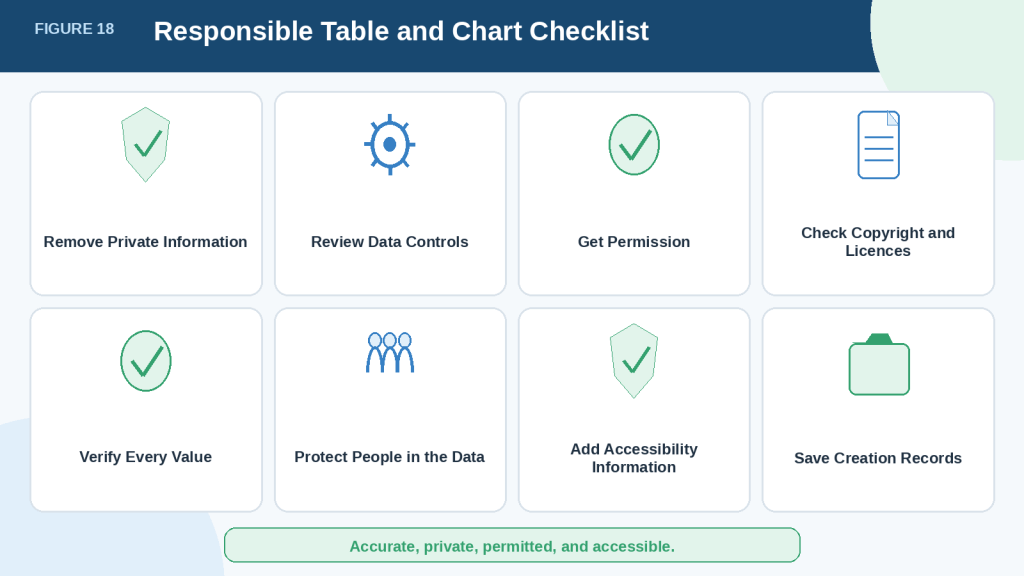
Figure 18. Responsible table and chart creation requires privacy protection, permission, verification, accessibility, and clear records.
Creating a useful visual involves more than arranging numbers. The source information must be handled lawfully and responsibly, checked for accuracy, presented accessibly, and supported by records showing how the final table or chart was produced.
Frequently Asked Questions
Can ChatGPT Create a Table from a PDF?
Yes. ChatGPT can often extract information from a PDF and organize it into a table.
Results are usually more reliable when the PDF contains selectable digital text. Accuracy may be lower when the file contains:
· Scanned pages
· Photographs of tables
· Blurred text
· Handwriting
· Complicated layouts
· Merged or overlapping cells
· Important information stored only in images
Always compare the completed table with the original PDF before using it.
Can ChatGPT Create a Chart Directly from a Document?
Yes, but creating a chart directly from an unverified document can increase the risk of errors.
A safer workflow is:
1st Upload the document.
2nd Ask ChatGPT to extract the required information.
3rd Organize the information into a table.
4th Compare the table with the original document.
5th Correct any errors.
6th Create the chart from the verified table.
7th Compare the finished chart with the table.
This process makes it easier to find mistakes before they appear in the chart.
What Is a Good Prompt for Creating a Table?
A useful prompt should explain:
· What information to extract
· Which section or time period to use
· What column headings to create
· How to arrange the rows
· How to handle missing information
· Whether source locations should be included
Example prompt:
Read the uploaded document and extract all monthly sales totals from the section titled “2026 Sales Results.” Create a table with the columns Month, Sales, and Source Location. Keep the months in chronological order. Use only information stated in the document. Do not estimate missing values. Mark missing information as “Not provided.”
Which Chart Type Should a Beginner Use?
The correct chart depends on the information and the question you want to answer.
· Use a bar chart to compare separate categories.
· Use a line chart to show change over time.
· Use a pie chart to show parts of one meaningful total.
· Use a scatter chart to explore a possible relationship between two numerical values.
· Use a table when readers need exact values or detailed text.
Bar charts and line charts are often the easiest for beginners to create, understand, and verify.
Can ChatGPT Recommend the Best Chart Type?
Yes. ChatGPT can review a verified table and recommend a suitable chart.
Example prompt:
Review this verified table and recommend the most suitable chart type. Explain what the chart would show, why it is appropriate, and any limitations. Do not create the chart until I approve your recommendation.
The recommendation should still be reviewed. ChatGPT may choose a chart that is technically possible but not the clearest option for your audience.
Can ChatGPT Calculate Totals, Averages, and Percentages?
Yes. ChatGPT can perform calculations such as:
· Totals
· Averages
· Percentages
· Percentage changes
· Differences
· Ratios
· Rankings
However, calculations may contain mistakes.
Ask ChatGPT to show:
· The original values used
· The formula
· The calculation steps
· The final result
Check important calculations with a calculator or spreadsheet program before publishing them.
What Should I Do When a Value Is Missing?
Do not assume that a missing value means zero.
A missing value may mean:
· Not reported
· Not available
· Not applicable
· Not measured
· Still being collected
· Unclear in the original document
Use a prompt such as:
Mark every missing value as “Not provided.” Do not estimate it or replace it with zero.
A value should be entered as zero only when the original document clearly states that the amount is zero.
Can ChatGPT Read a Scanned Table?
ChatGPT may be able to read some scanned tables, but the results may be less reliable than those from a text-based document or spreadsheet.
To reduce errors:
· Use the clearest available scan.
· Upload one page or section at a time.
· Ask ChatGPT to show the extracted values before calculating anything.
· Check every row against the original page.
· Paste the information as text when possible.
· Use a spreadsheet version when one is available.
Do not rely on an extracted scanned table without checking it carefully.
Can I Download a Table Created by ChatGPT?
Some ChatGPT tables include a download option. The table may be downloadable as a CSV file that can be opened in programs such as:
· SoftMaker PlanMaker
· Microsoft Excel
· Google Sheets
· LibreOffice Calc
After opening the file, check that:
· All rows and columns are present.
· Dates display correctly.
· Currency symbols are preserved.
· Percentages have not changed.
· Long numbers remain complete.
· Leading zeros have not disappeared.
· Special characters display properly.
Spreadsheet software may automatically reformat some values.
Can I Download a Chart Created by ChatGPT?
Some ChatGPT charts include a download option and may be saved as PNG image files.
Before downloading the final version, confirm that the chart includes:
· A clear title
· Correct values
· Labelled axes
· Measurement units
· Readable category names
· A fair scale
· A legend when needed
· Accessible labels and contrast
Download the chart again after making corrections so that you do not accidentally use an earlier version.
Can I Add the Table or Chart to WordPress?
Yes.
To add a table, select the WordPress Add block button, search for Table, and choose the required number of rows and columns. You can then enter or paste the verified information.
To add a chart, upload the image through the Media Library or insert it with an Image block.
When publishing a chart, include:
· Descriptive alt text
· An image title
· A caption
· A short explanation
· The source
· Important limitations
· A nearby table or written summary when useful
The exact menu names and buttons may vary depending on the WordPress plan, theme, editor, or update.
Should I Publish the Table with the Chart?
In many cases, using both is the best approach.
The chart gives readers a quick visual summary, while the table provides exact values.
Include the table when:
· Exact figures are important.
· Readers may need to verify the chart.
· The chart contains several categories.
· Accessibility is important.
· The visual does not show every value clearly.
For a very long table, you may publish a shorter summary table and provide access to the complete data separately when appropriate.
Can I Change a Chart After ChatGPT Creates It?
Yes. You can ask ChatGPT to change the chart’s presentation.
Possible changes include:
· Selecting a different chart type
· Improving the title
· Adding axis labels
· Adding measurement units
· Correcting the category order
· Increasing the text size
· Using a horizontal layout
· Adding direct value labels
· Removing three-dimensional effects
· Improving accessibility
· Changing the scale
Use this instruction:
Change only the chart presentation. Do not change, remove, combine, calculate, or add any data.
Compare the revised chart with the verified table after every change.
Is a ChatGPT-Created Chart Automatically Accurate?
No.
A chart may look professional while containing:
· Incorrect values
· Missing categories
· Calculation errors
· An unsuitable chart type
· A misleading scale
· Incorrect labels
· Missing units
· Incomplete context
Before publishing, compare the chart with:
· The verified table
· The original document
· The calculation records
· Relevant notes and footnotes
Do I Need to Disclose That ChatGPT Helped Create the Table or Chart?
Disclosure may be appropriate when readers should know how the information was prepared or when a school, employer, client, publisher, or platform requires it.
Example disclosure:
ChatGPT was used to help organize the source information and prepare the chart. All values were checked against the original document before publication.
Only state that the values were checked if you actually completed the verification.
How Often Should I Check ChatGPT’s Current File and Chart Rules?
You do not need to reread every policy before every ordinary task.
Check the current official guidance:
· When using document analysis for the first time
· After changing your ChatGPT plan or model
· When working with an important or sensitive document
· When a previously available feature changes
· After receiving a product or policy update
Features, supported files, upload limits, privacy settings, and download options may change over time.
Key Takeaways
ChatGPT can help turn information from documents into clear tables and charts, but the results must be reviewed carefully.
Remember these main points:
· Start with a clear, readable document.
· Decide what information you want to extract before writing the prompt.
· Ask for specific column headings and row order.
· Tell ChatGPT not to guess or invent missing values.
· Mark missing information as “Not provided” rather than automatically using zero.
· Create and verify the table before creating the chart.
· Compare every important value with the original document.
· Use a bar chart to compare categories.
· Use a line chart to show change over time.
· Use a pie chart only when the values form one meaningful total.
· Use a scatter chart to explore a possible relationship between two numerical values.
· Keep a table when readers need exact values.
· Check totals, percentages, units, currencies, dates, labels, and chart scales.
· Do not assume that a polished chart is accurate.
· Do not claim that a chart proves why something happened unless the document provides evidence.
· Protect private and confidential information before uploading a file.
· Confirm that you have permission to use and publish the source information.
· Add alt text, a caption, an explanation, and a nearby table or written summary when publishing a chart.
· Save the original document, prompts, verified table, calculations, chart, permissions, and final publication records.
· Check current official guidance when features, plans, privacy settings, or file-upload rules change.
The safest workflow is simple:
1. Upload the document.
2. Extract the required information.
3. Create a table.
4. Verify the table against the source.
5. Correct any errors.
6. Select the appropriate chart type.
7. Create the chart from the verified data.
8. Review the chart’s values, labels, scale, context, and accessibility.
9. Save and publish the approved version with the necessary explanation and source information.
Final Reminder: Verify first and visualize second. A table or chart should make accurate information easier to understand, not make uncertain information appear more convincing.
Final Tip
Treat every ChatGPT-created table and chart as a draft until you have checked it against the original document.
Use this final review question:
Does every value, label, category, calculation, scale, and written conclusion match the original source?
When something is unclear, return to the document before making the chart more attractive. Accuracy should always come before design.
A simple chart based on verified information is more useful than a polished chart based on uncertain data.
Continue Learning
Continue building your document-analysis skills with these related AI Mastery guides:
· How to Analyze Documents with ChatGPT: Beginner Guide (2026)
· How to Compare Documents with ChatGPT: Beginner Guide (2026)
· How to Extract Information from Documents with ChatGPT: Beginner Guide (2026)
· How to Ask Questions About Documents with ChatGPT: Beginner Guide (2026)
These guides explain how to examine documents, compare information, extract important details, and ask focused questions before organizing the results into tables and charts.
Sources and References
The following official sources were used to confirm the document-upload, data-analysis, privacy, and accessibility information in this guide.
OpenAI Help Center — Data Analysis with ChatGPT
Explains how ChatGPT can analyze uploaded files, create tables and charts, perform calculations, and work with structured information. It also recommends clear column headings, one record per row, and specific instructions about the required analysis or chart.
OpenAI Help Center — Extracting Insights with ChatGPT Data Analysis
Describes interactive tables, chart creation, chart editing, and downloading tables and charts.
OpenAI Help Center — File Uploads FAQ
Explains common document tasks, supported uses, upload restrictions, file limits, and how uploaded files may be handled and retained.
OpenAI Help Center — What Types of Files Are Supported?
Lists commonly supported document, spreadsheet, presentation, and text formats, including XLSX, XLS, CSV, TSV, DOCX, PPTX, PDF, and TXT. Supported formats may change over time.
OpenAI Help Center — Visual Retrieval with PDFs FAQ
Explains how ChatGPT may read text, images, graphs, diagrams, and other visual content embedded in PDF files. The current official guidance states that visual retrieval for embedded PDF visuals is available to eligible ChatGPT Enterprise users and that processing can differ depending on how the PDF is uploaded.
OpenAI Help Center — Data Controls FAQ
Explains how users can manage whether new ChatGPT conversations may be used to improve OpenAI’s models. It also provides information about Temporary Chat, data export, account deletion, and other data controls.
OpenAI Help Center — Data Usage for Consumer Services FAQ
Provides information about how content submitted through individual ChatGPT services may be used and how users can control model-improvement preferences.
World Wide Web Consortium — Complex Images
Explains that charts, graphs, diagrams, and other complex images usually require more information than short alternative text alone can provide. Important chart details should also be available in nearby text, a data table, or a longer description.
World Wide Web Consortium — Images Tutorial
Provides guidance for writing alternative text for different types of images. For complex images such as charts and diagrams, it recommends supplying a complete text equivalent of the important data or information presented visually.
World Wide Web Consortium — Tables Tutorial
Provides guidance for creating accessible data tables with properly identified row and column headings, captions, and relationships between header and data cells.
ChatGPT features, supported formats, file limits, privacy settings, and data-handling rules may change. Check current official guidance when first using these features, after changing plans or workspaces, when a feature behaves differently, or after receiving a policy-update notice.
This article provides general educational information. It is not legal, privacy, financial, medical, accessibility-compliance, or other professional advice.
.
 AI Mastery