Estimated reading time: 25–30 minutes
Last updated: August 16, 2026
Introduction
A website becomes easier to build when you decide what pages it needs and how visitors will move between them before you start adding large amounts of content. This planning step is called information architecture: organizing information so people can understand where they are, what is available, and where to go next.
For a complete beginner, you do not need a complicated diagram or specialist software. A simple page list, a basic sitemap, and a short navigation menu are enough to create a strong starting structure. Artificial intelligence can help you brainstorm page ideas, compare possible menu arrangements, and identify missing visitor paths, but you should still review every suggestion against the real purpose of your site.
This guide uses WordPress.com examples because AI Mastery is built with the WordPress Site Editor. WordPress.com currently uses the Navigation block in Site Editor themes for building and editing site menus. Menu wording and available controls can vary by theme, plan, editor, and future updates, so always follow the current labels shown in your dashboard.
The aim is not to create the largest menu possible. The aim is to help visitors reach the most important areas of your website with as little confusion as practical.
What You’ll Learn
By the end of this guide, you will understand how to plan a small website structure before building or reorganizing it.
You will learn how to:
- decide which information belongs on pages and which belongs in posts
- choose the core pages a beginner website actually needs
- create a simple sitemap before editing WordPress
- plan a clear top-level navigation menu
- write short, understandable menu labels
- use dropdown menus without creating unnecessary complexity
- plan mobile-friendly navigation
- use AI to suggest and review a page structure
- check navigation for basic accessibility
- identify privacy, contact, copyright, and licensing concerns
- avoid common page and navigation mistakes
- save a page map that can guide future website updates
Before You Start
You do not need to redesign your whole site while reading this article. Planning first is safer than making many live changes at once.
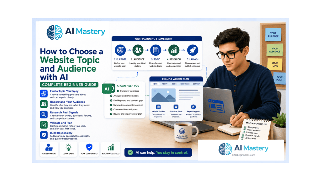
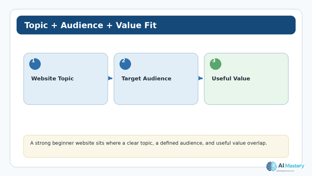
Have a simple description of your website topic, audience, and main goal. If you completed Article 091 and Article 092, use the website purpose and audience decisions you made there. If not, write one sentence describing who the site is for and what you want visitors to be able to do.
For example: ‘AI Mastery helps complete beginners learn practical AI tools through step-by-step tutorials.’ That one sentence is enough to begin asking which pages and navigation choices support the goal.
Protect Your Existing Site
Before making major changes to an established WordPress menu, record the current structure. A screenshot or written page list makes it easier to restore an item if you remove or move something by mistake.
Keep the First Plan Small
A beginner website can start with a small set of clear destinations. You can add pages later when there is a genuine reason. Planning too many empty pages at the beginning often creates more maintenance work without helping visitors.
What Are Website Pages and Navigation?
A page is a stable piece of website content with its own address, such as Home, About, Contact, or a Tutorials landing page. Navigation is the system of links that helps visitors move among those pages and other important destinations.
The page structure and the navigation menu are related, but they are not identical. Your site may contain pages that do not need to appear in the main menu, while the menu may also link to categories, posts, search, social links, or another useful destination.
A good beginner rule is to plan the content structure first and then decide which parts deserve a place in the main navigation.
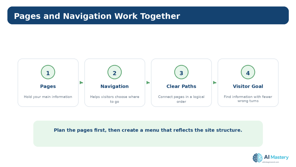
Figure 1. Website pages provide destinations, while navigation gives visitors clear paths between the most important destinations.
Explanation: Planning the pages first makes it easier to decide which destinations deserve a place in the main menu.
Understand Pages and Posts Before Planning the Menu
WordPress separates Pages and Posts because they usually serve different purposes. Pages are commonly used for relatively timeless site information, while posts are commonly used for dated articles, tutorials, news, or other regularly published content.
For AI Mastery, Home, Tutorials, AI Tools, AI News, About, and Contact are pages. Individual tutorials are posts. This distinction makes the site easier to organize because the navigation can point to stable landing pages while new tutorials continue to be published as posts.
Use Pages for Stable Destinations
Good page candidates include Home, About, Contact, a Tutorials hub, an AI Tools hub, and other permanent areas that explain or organize the site.
Use Posts for Ongoing Educational Content
A tutorial such as ‘How to Plan Website Pages and Navigation with AI’ belongs in a post because it is part of an ongoing article series rather than a permanent structural page.
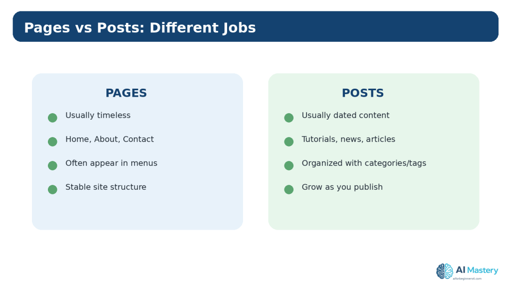
Figure 2. Pages and posts serve different purposes in WordPress and should not be treated as interchangeable menu items.
Explanation: Stable pages often form the website structure, while posts grow over time as new educational content is published.
Choose the Core Pages Your Website Needs
Start with purpose, not with a template that tells you every site needs ten pages. Ask what information a visitor genuinely needs to understand the website and complete the main actions you want to support.
For a beginner educational website, the core structure often includes a home page, one or more learning or resource hubs, an About page, and a Contact page. Depending on the site, you may also need privacy, accessibility, terms, disclosure, or other policy pages. Those requirements depend on what the site does, where it operates, what information it collects, and which services it uses.
Do not ask an AI tool to invent legal facts about your website. If you create a privacy or legal page, the content must accurately describe your actual practices and may require professional advice.
Home
The Home page should quickly explain what the website is, who it helps, and where a new visitor can start. It does not need to contain every article or every category.
Learning or Resource Hubs
A hub page organizes related content. For AI Mastery, Tutorials and AI Tools are examples of pages that can guide visitors toward groups of posts without placing every post directly in the main menu.
About
The About page helps visitors understand the purpose of the website and who is responsible for it. Keep claims accurate and avoid publishing personal information that is not necessary.
Contact
The Contact page should provide a safe way for visitors to reach you. Avoid publishing private home addresses, personal credentials, or unnecessary sensitive details. If a form collects personal information, understand how the information is processed and stored.
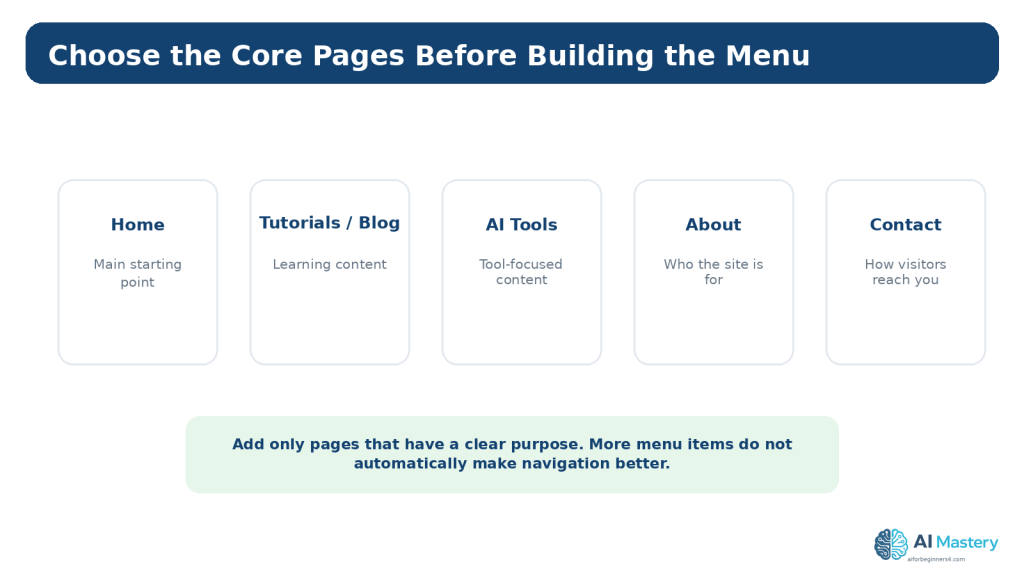
Figure 3. Start with a small set of core pages that each have a clear visitor purpose.
Explanation: A short page list is easier to maintain and gives you a clearer foundation for the navigation menu.
Create a Simple Sitemap Before Building the Menu
A sitemap in this context is simply a planning diagram showing how the main sections of the website relate to one another. It does not need to be the technical XML sitemap used by search engines.
Write Home at the top. Under it, place the main areas that visitors should be able to reach directly. Then add only the most useful subareas beneath those sections.
For example, an educational AI website might place Tutorials and AI Tools at the top level, with subject areas such as ChatGPT, Google Gemini, Claude AI, AI Video, and AI Coding grouped underneath a suitable hub rather than presented as a long flat list.
The sitemap lets you identify duplication before you touch WordPress. If two planned pages have almost the same purpose, combine them or clarify the difference.
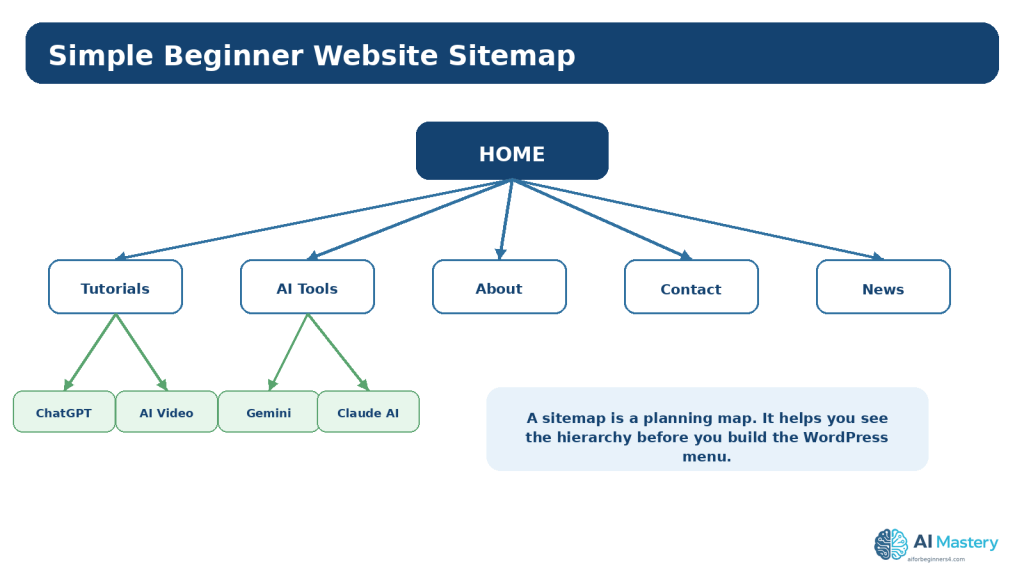
Figure 4. A simple sitemap helps you see the page hierarchy before you edit the live WordPress navigation.
Explanation: The sitemap is a planning map, not the technical XML sitemap used by search engines.
Plan Visitor Journeys, Not Just a Menu
A navigation menu is useful only when it helps a real visitor complete a task. Imagine a new visitor arriving with a question and trace the path you expect that person to follow.
Someone arriving at the Home page may need to understand the site, choose Tutorials, select a topic, read an article, and then continue to a related tutorial. Someone arriving directly from a search engine may begin on an article instead and need clear internal links to reach a broader topic page or the next lesson.
This is why navigation includes more than the header menu. Breadcrumbs, category links, internal links, related-post sections, buttons, and footer links can all support movement through the website when used clearly.
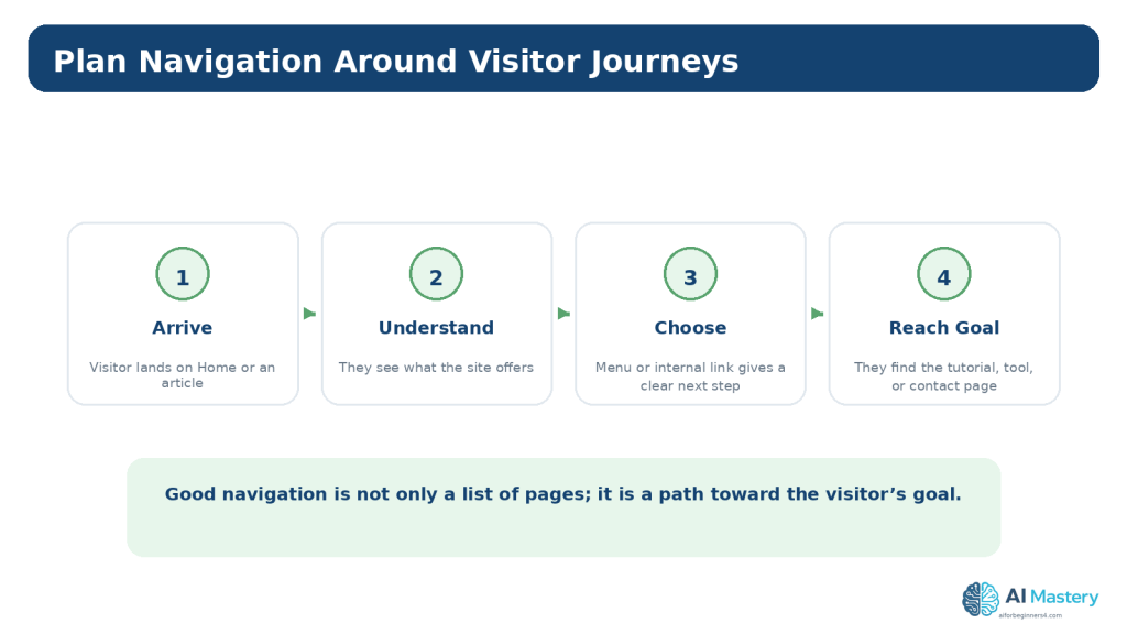
Figure 5. Navigation should support visitor journeys, not simply display a list of available pages.
Explanation: Thinking about the visitor’s goal helps you decide which menu items and internal links are genuinely useful.
Write Clear Navigation Labels
Menu labels should tell visitors where a link goes without making them guess. Short, familiar labels are normally easier to scan than creative phrases whose meaning is unclear.
For example, ‘Tutorials’ is usually clearer than ‘Start Exploring Knowledge.’ ‘Contact’ is usually clearer than ‘Let’s Connect With Us Today.’ The longer phrase may sound friendly, but it adds words without improving the destination description.
Use the same label consistently when it refers to the same destination. W3C accessibility guidance emphasizes clear headings and consistent navigation because predictable structure helps people understand and move through content.
Keep Labels Short
A top navigation bar has limited space, especially on smaller screens. Short labels are easier to scan and adapt more easily to mobile layouts.
Avoid Labels That Depend on Context
A visitor may encounter a menu without reading the surrounding page first. Prefer labels that still make sense when viewed on their own.
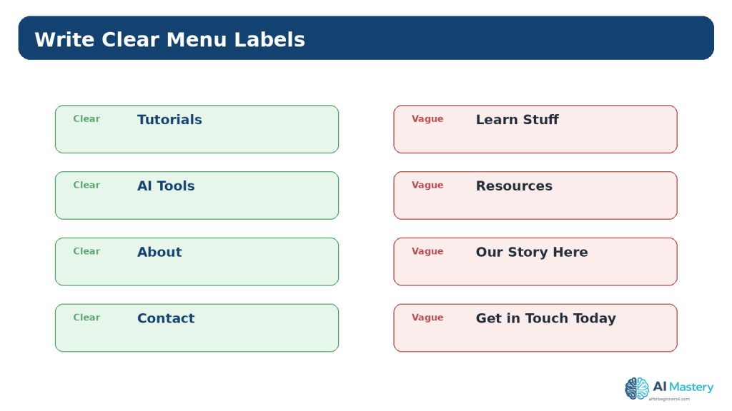
Figure 6. Short, familiar navigation labels are usually easier to understand than vague or decorative wording.
Explanation: Visitors should be able to predict the destination from the menu label without needing extra context.
Decide What Belongs in the Main Menu
The main menu should contain the destinations that matter most across the whole site. It is not a complete inventory of every page and post.
For a beginner site, a small set of top-level items is easier to understand and maintain. If you have many articles, organize them through hub pages, categories, or carefully designed submenus rather than adding each article to the header.
A useful test is to ask: Would a new visitor reasonably expect to need this destination from almost anywhere on the site? If not, it may belong in the page content or footer instead of the main menu.
Use Dropdown Menus Carefully
WordPress.com allows nested menu items and dropdown navigation. Dropdowns can help group closely related sections, but they can also make a menu harder to use if they contain too many levels or unclear groupings.
Keep the hierarchy shallow. A visitor should be able to understand the categories without opening layer after layer. If a section has many subtopics, consider linking the top-level item to a well-organized hub page that presents the choices in the page content.
Before creating a dropdown, ask whether the hierarchy is genuinely useful or whether it is simply hiding an oversized menu.
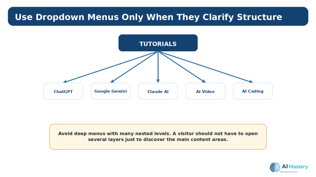
Figure 8. Dropdown menus work best when they group related destinations without creating several levels of hidden navigation.
Explanation: A hub page can often handle a large content area more clearly than a deeply nested menu.
Plan Footer Navigation and Secondary Paths
The header is not the only place where visitors can navigate. A footer can provide secondary links that are useful across the site but do not need to compete for space in the main menu. Examples can include Privacy, accessibility information, terms, disclosure pages, a contact link, or other site-wide references.
Keep the footer organized rather than turning it into a second oversized menu. Group related links under short headings when necessary, and avoid repeating every header item unless the repetition genuinely helps visitors. If the header and footer contain the same navigation set, keep the labels consistent.
A footer is also a useful place for information that visitors may need occasionally but not during every visit. The exact choice depends on the site, its audience, and its obligations.
Separate Primary and Secondary Navigation
Primary navigation should emphasize the main visitor journeys. Secondary navigation can support policies, utility pages, and less-frequent destinations without making the header crowded.
Do Not Hide Essential Tasks
A destination that nearly every visitor needs should not be placed only in a difficult-to-find footer. Decide placement according to importance, not simply available space.
Use Categories, Search, and Hub Pages to Reduce Menu Clutter
As a website grows, the number of posts can become much larger than the number of permanent pages. Trying to represent every article in the main navigation is not practical. WordPress categories, hub pages, and search can provide additional ways to discover content without expanding the header indefinitely.
A category can group related posts, while a hub page can introduce a subject and link to selected articles in a more guided order. Search can help visitors who already know what they are looking for. These tools support the navigation system, but they do not replace a clear top-level structure.
For example, a Tutorials page can introduce major learning areas and link to ChatGPT, Google Gemini, Claude AI, AI Video, and AI Coding sections. The main menu can remain short while the hub page carries the detailed choices.
Connect Navigation with Internal Links
Visitors do not always enter through the Home page. Search engines, social links, bookmarks, and shared URLs may take them directly to a tutorial or another deep page. Internal links inside the content should help those visitors understand what to read next and how the current page relates to the rest of the site.
Link to broader hub pages when readers may need context. Link to the next lesson when a series has a logical order. Link to a related page only when it is genuinely useful rather than adding links for the sake of having more links.
Internal links and the main menu should support the same overall information architecture. If the menu calls a section ‘AI Tools’ but article links repeatedly use a different label for the same destination, the experience can become less predictable.
Review Navigation After Publishing
A page plan is not permanent. The structure should be reviewed when you publish a major new section, rename important pages, change the website purpose, or discover that visitors are struggling to find something.
Start with simple checks: test every menu item, review the mobile menu, search for broken links, confirm that page names still match their content, and make sure old navigation items have not been left behind after changes. Analytics and visitor questions can also reveal areas that deserve attention, but numbers should be interpreted in context rather than used as automatic instructions.
Keep a dated copy of the sitemap or page map whenever you make a substantial change. A saved record helps you understand how the structure evolved and makes it easier to restore a previous arrangement if a redesign creates unexpected problems.
Build or Edit the Menu in WordPress.com
For WordPress.com sites that use the Site Editor, the current menu workflow uses the Navigation block. WordPress.com support currently directs users to the site dashboard, then Appearance → Editor, where the Navigation block can be selected in the header, template, or template part.
The exact appearance can vary by theme and WordPress updates. If your site does not show Appearance → Editor, it may be using a different theme system and the navigation controls may appear elsewhere.
Add a Page to the Navigation Block
Open the Site Editor, select the Navigation block, use the block inserter to add a page or link, then save the site changes. WordPress.com also provides controls for reordering items and creating submenus.
Reorder Menu Items
Arrange items according to importance and visitor expectations rather than alphabetically unless alphabetical order genuinely helps. Keep Home or the site logo easy to use as a return path to the starting point.
Save and Test
After saving, open the public site rather than relying only on the editor preview. Select every menu item and confirm it reaches the intended destination.
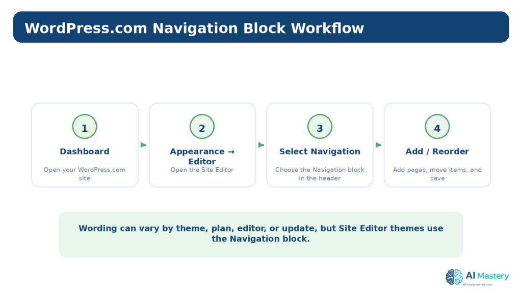
Figure 7. Site Editor themes on WordPress.com use the Navigation block to build and edit the website menu.
Explanation: The exact interface can change, so readers should follow the current labels shown in their own WordPress.com dashboard.
Plan Navigation for Mobile Screens
A menu that fits across a desktop header may be converted into a compact mobile menu when the screen becomes narrower. Do not assume the mobile version works simply because the desktop version looks correct.
Preview the site at narrow widths and, when possible, test it on an actual phone. Confirm that the menu opens, the labels remain readable, submenus can be reached, and no important destination disappears.
If the menu becomes difficult to use on a small screen, simplify the structure instead of relying on tiny text or several levels of nesting.
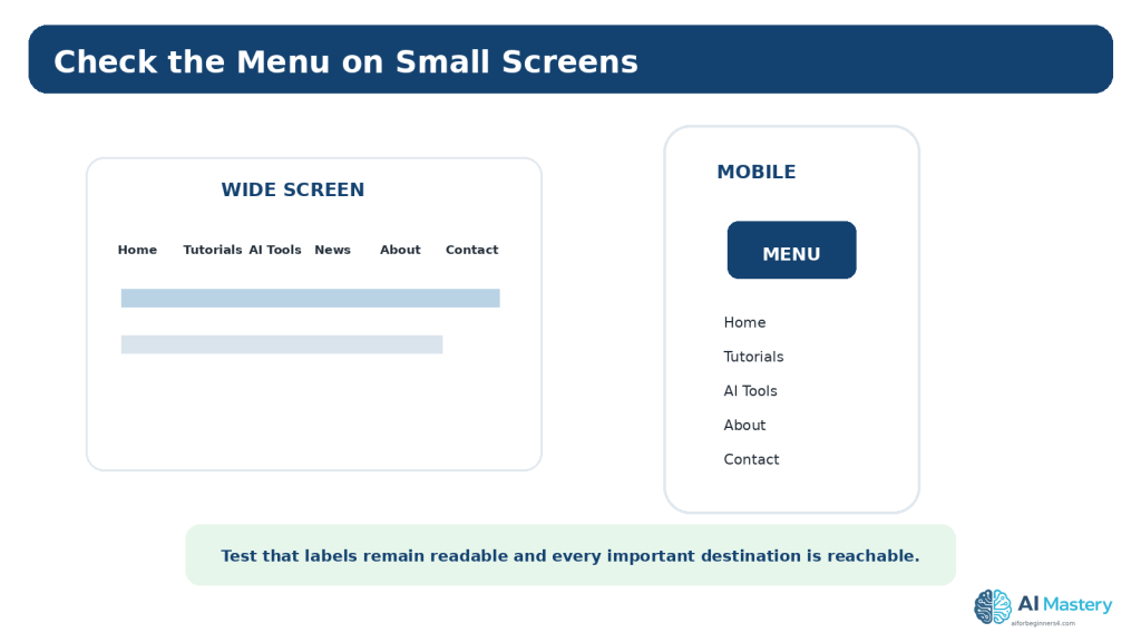
Figure 9. A navigation plan should be tested at narrow widths so important destinations remain reachable on phones and enlarged layouts.
Explanation: Mobile testing can reveal crowded labels or submenus that were not a problem on a wide desktop screen.
Make Navigation More Accessible
Navigation affects accessibility because visitors may use a mouse, keyboard, touch screen, screen reader, magnification, or another assistive technology. WCAG 2.2 includes requirements and guidance related to consistent navigation, focus visibility, link purpose, headings, reflow, and keyboard operation.
You do not need to become an accessibility specialist before planning a menu, but you can adopt several good habits from the beginning.
Keep Navigation Consistent
When the same navigation appears across multiple pages, keep its relative order and naming consistent unless a change is needed for a clear reason. Predictability reduces unnecessary learning for visitors.
Use Meaningful Link Text
A menu item such as ‘Tutorials’ communicates more about the destination than a vague label such as ‘Go.’ Link wording should help people understand what will happen when they activate it.
Keep Keyboard Focus Visible
When a visitor moves through links with the keyboard, the currently focused item should remain visibly identifiable. Do not remove focus indicators without providing an accessible replacement.
Check Contrast and Reflow
Navigation text needs sufficient contrast against its background, and the menu should remain usable when the page is enlarged or displayed at narrow widths.
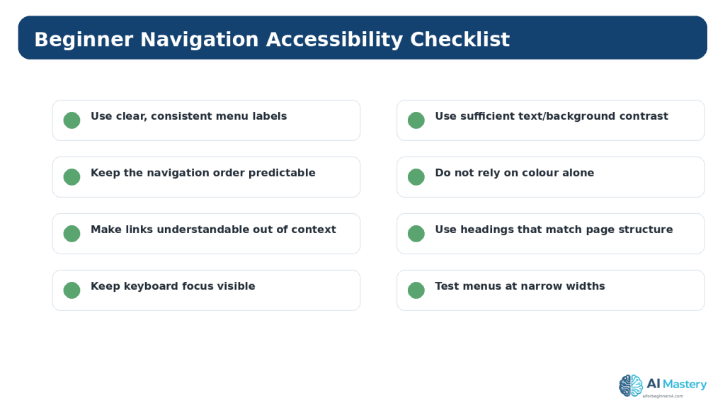
Figure 10. Beginner navigation accessibility includes consistency, meaningful links, visible focus, readable contrast, logical headings, and flexible layouts.
Explanation: These checks are useful starting habits, but they are not a complete WCAG conformance evaluation.
Use AI to Plan Pages and Navigation
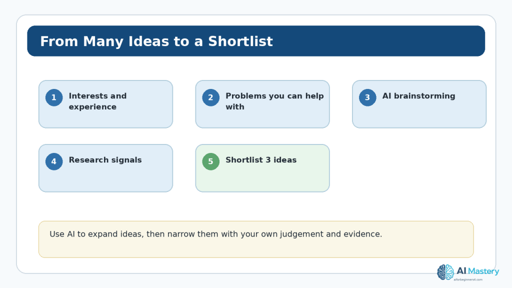
AI can be useful during the planning stage because it can quickly generate several possible structures for you to compare. The quality of the result depends heavily on the context you provide.
Do not begin with a vague request such as ‘Plan my website.’ Tell the AI what the website is about, who it serves, what content already exists, and what actions visitors should be able to complete. Then ask for a simple structure rather than a large menu.
A useful prompt is: ‘I am planning a beginner educational website about [topic] for [audience]. The main goal is [goal]. Suggest the smallest useful set of permanent pages, a simple top navigation menu, and any logical dropdowns. Explain the purpose of each item. Do not add pages unless they have a clear visitor purpose.’
Treat the response as a draft. Compare it with your actual content, remove unnecessary pages, check terminology, and decide whether each proposed link helps a real visitor.
Ask AI to Compare Two Menu Plans
If you have two possible structures, ask the AI to compare them for clarity, duplication, mobile complexity, and beginner usability. Do not ask it to choose based only on style; give it the visitor goals.
Ask AI to Identify Missing Paths
You can also provide the page list and ask whether a visitor can reach important destinations such as Tutorials, About, and Contact without unnecessary steps.
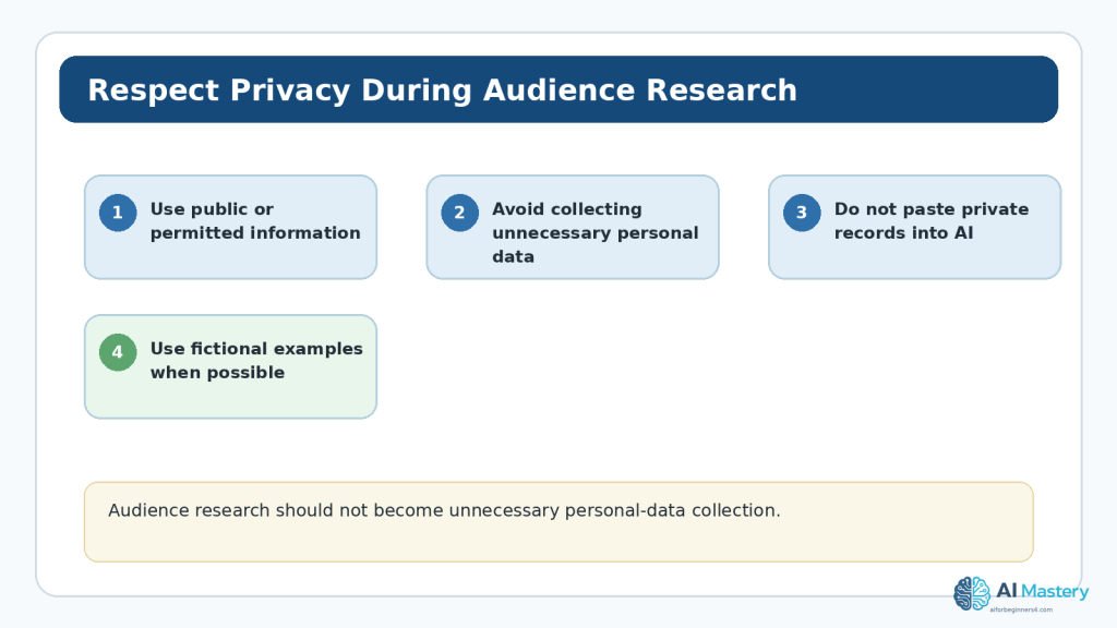
Do Not Share Private Information
Remove private customer information, passwords, credentials, unpublished business data, private addresses, or other sensitive details before pasting a site plan into an online AI service. OpenAI provides Data Controls and Temporary Chat options, but these controls are not a reason to share information that is unnecessary for the task.
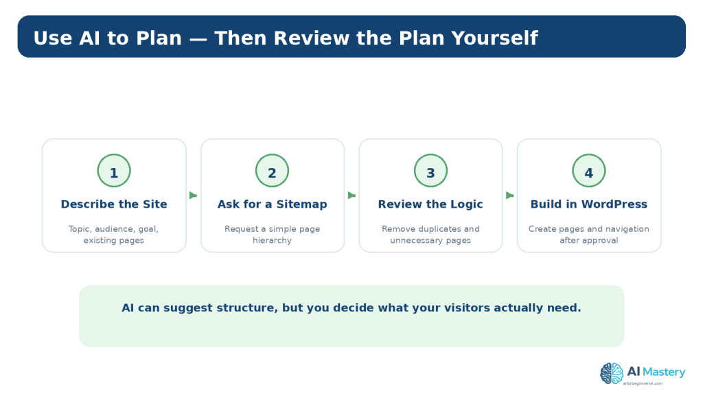
Figure 11. AI can suggest a page hierarchy, but the site owner should review the structure before making live WordPress changes.
Explanation: Providing topic, audience, visitor goals, and existing pages usually produces a more useful planning draft.
Review Privacy, Permissions, and Licensing
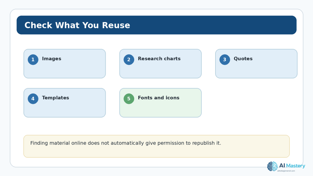
A page plan can reveal that your website needs forms, downloadable resources, images, fonts, templates, or third-party services. Planning is a good time to record the privacy and licensing questions that must be resolved before publication.
For a Contact page, decide what information you actually need to collect. For downloadable or visual assets, verify ownership and licence terms. For templates, fonts, icons, or stock material, check whether the intended use is permitted and whether attribution or licence notices are required.
Do not assume AI-generated legal or privacy wording automatically matches your website. Privacy notices and legal pages must reflect the actual services, data practices, jurisdiction, and obligations that apply to your site. This article provides general educational guidance and not legal advice.
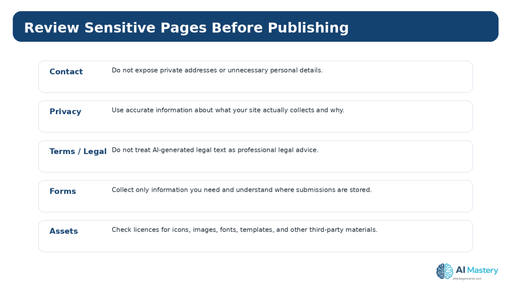
Figure 12. Structural website pages can create privacy, legal, and licensing responsibilities that should be reviewed before publication.
Explanation: Do not assume generic AI-generated legal or privacy wording accurately describes your real website or obligations.
Common Mistakes Beginners Make
Mistake 1: Putting Every Page in the Main Menu
A menu is not a complete page directory. Too many top-level items make scanning harder and can create an especially crowded mobile experience. Use hub pages and contextual links for secondary destinations.
Mistake 2: Using Vague Labels
Creative wording can make visitors guess. Prefer familiar labels when they describe the destination accurately.
Mistake 3: Building the Menu Before Deciding Page Purpose
If the page structure is unclear, the menu will simply reproduce that confusion. Decide what each page does first.
Mistake 4: Creating Deep Dropdowns
Several nested submenu levels can be difficult to scan, especially on touch devices and for people using assistive technology. Keep the hierarchy shallow.
Mistake 5: Ignoring Mobile Navigation
A desktop menu can appear fine while the compact mobile menu is confusing or incomplete. Test both.
Mistake 6: Forgetting Existing Links After Renaming or Removing Pages
Changing a page address or deleting a page can create broken links. Review navigation and internal links whenever structural pages change.
Mistake 7: Publishing an AI-Generated Sitemap Without Review
An AI tool may suggest unnecessary pages, duplicate ideas, or terminology that does not match your audience. Use the output as a planning draft, not as an automatic site architecture.
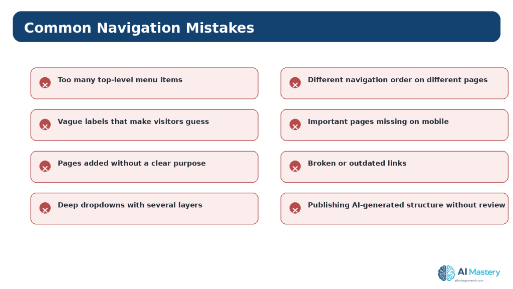
Figure 13. Common navigation mistakes usually come from unnecessary complexity, unclear labels, inconsistent structure, or insufficient testing.
Explanation: Fixing these problems at the planning stage is easier than rebuilding the navigation after many pages have been published.
Benefits and Limitations of Using AI for Navigation Planning
AI can speed up brainstorming and help you see alternative ways to group information. It can also explain unfamiliar planning terms, rewrite long menu labels, or point out obvious duplication.
The limitation is that an AI system does not automatically know which pages your real visitors value, what content you have actually published, which legal obligations apply, or how people behave on your live site. It can also produce confident suggestions that are unnecessary or inaccurate.
Use AI to generate options, then use your own content knowledge, visitor feedback, analytics, accessibility checks, and current WordPress documentation to make the final decisions.
Myths About Website Pages and Navigation
Myth 1: More Menu Items Make a Website More Useful
Reality: More choices can increase clutter. A smaller set of meaningful destinations is often easier for beginners to understand.
Myth 2: Every Page Must Appear in the Header
Reality: Some pages are reached through footer links, internal links, search, categories, or contextual calls to action rather than the main menu.
Myth 3: A Dropdown Is Always More Organized
Reality: A dropdown is useful only when the grouping is clear. It can hide complexity instead of solving it.
Myth 4: AI Can Automatically Design the Perfect Site Structure
Reality: AI can propose structures, but only you can verify that they match your content, audience, obligations, and real visitor needs.
Myth 5: Navigation Is Finished Once the Site Launches
Reality: Navigation should be reviewed when you add major content areas, change page names, receive visitor feedback, or notice that important destinations are hard to find.
Practical Exercise: Plan a Six-Page Beginner Website
Create a one-page planning document before opening WordPress. Write the website goal at the top. Then list six potential permanent pages. For each page, write one sentence explaining its purpose and the visitor question it answers.
Next, circle the pages that deserve a place in the main navigation. If all six seem essential, check whether any can be grouped under a hub page. Draw arrows showing how a new visitor could move from Home to the main learning area, to an individual article, and then to a related next step.
Finally, ask an AI tool to review your plan for duplication, vague labels, unnecessary menu depth, and missing visitor paths. Accept only suggestions that you understand and that fit the actual site. Save the final sitemap with your website planning records so you can compare future changes with the original structure.
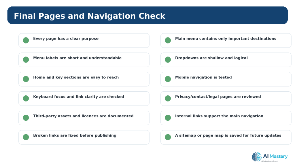
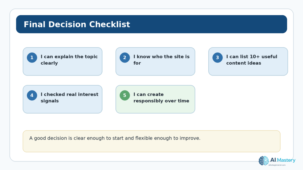
Figure 14. Use a final checklist before publishing or substantially changing the website structure.
Explanation: Saving the approved sitemap and checklist makes future updates easier to review and maintain consistently.
Frequently Asked Questions
How many pages should a beginner website have?
There is no required number. Start with the pages needed to explain the site and support its main visitor goals. Add more only when a new purpose appears.
How many items should be in the main menu?
There is no universal limit, but a shorter menu is usually easier to scan. If the header becomes crowded, review whether some items belong under a hub or in the footer instead.
Should Home appear in the menu?
It can. Many sites also make the logo or site title link to Home. Choose a pattern that is clear and consistent for your audience.
Should categories appear in the navigation?
They can when categories represent major content areas. WordPress.com supports adding category links to navigation. Do not add every category automatically; use the ones that help visitors browse.
Can I create dropdown menus in WordPress.com?
Yes. WordPress.com supports nested navigation items and dropdown menus. Keep them shallow and test them on mobile and with keyboard navigation.
Can ChatGPT design my entire site menu?
It can suggest a menu, but you should compare the suggestion with your real pages and visitor goals. Remove anything unnecessary and test the final structure on the live site.
Do I need a Privacy page?
That depends on what the site collects, which services it uses, where users are located, and applicable laws or platform requirements. Do not rely on a generic AI answer for a legal determination.
What should I do when I add a major new section later?
Update the saved sitemap, decide whether the new section needs a hub page or menu link, test the change on desktop and mobile, and review internal links that should point to it.
Key Takeaways
Plan the structure before editing the live menu. Pages should have clear purposes, and the main navigation should highlight the most important destinations rather than every piece of content.
Use short, understandable labels; keep dropdowns shallow; test on mobile; and consider keyboard, contrast, link purpose, heading structure, and consistency as part of navigation accessibility.
AI can help brainstorm and compare structures, but you remain responsible for checking visitor needs, privacy, licensing, accuracy, accessibility, and the final WordPress implementation.
Final Tip
Keep a simple saved sitemap even after the website is published. Whenever you consider adding a new page or menu item, compare it with that map and ask what visitor problem the new item solves.
If the answer is unclear, you probably do not need to add it yet. A small navigation system that visitors understand is more useful than a large one that looks comprehensive but creates confusion.
Continue Learning
Article 093 builds on
Article 091 — How to Plan a Beginner Website with AI (2026) and Article 092 — How to Choose a Website Topic and Audience with AI (2026). Article 094 — How to Create a Website Content Plan with AI (2026).
Article 095 — How to Plan Beginner SEO Content with AI (2026)
Article 096 — How to Review and Maintain an AI-Assisted Website (2026)
Sources and References
The following official and authoritative sources were reviewed for the WordPress, accessibility, privacy, copyright, and licensing information in this article. Information was checked on August 16, 2026. Platform interfaces, policies, standards, and licence conditions can change, so readers should check current official information when it matters to their project.
1. WordPress.com — WordPress Pages. Current guidance for creating and editing pages in WordPress.com. Open official source
2. WordPress.com — Use the Navigation Block. Current Site Editor workflow for adding and editing the Navigation block. Open official source
3. WordPress.com — Add and Edit Menus. Overview of WordPress.com menu editing with the Navigation block. Open official source
4. WordPress.com — Create a Menu. How published pages and other items are added to navigation. Open official source
5. WordPress.com — Add Links to a Menu. Current instructions for selecting the Navigation block and adding links. Open official source
6. WordPress.com — Create Drop-Down Menus. Current guidance for nested submenus and dropdown navigation. Open official source
7. WordPress.com — Customize the Menu Design. Notes the Site Editor workflow and differences for classic themes. Open official source
8. WordPress.com — Use the Site Editor. Current overview of the block-based Site Editor. Open official source
9. WordPress.com — Set the Homepage. Current instructions for setting and editing a static homepage. Open official source
10. W3C WAI — Web Content Accessibility Guidelines (WCAG) 2.2. Accessibility standard used for navigation, focus, link purpose, contrast, reflow, and consistency guidance. Open official source
11. W3C WAI — Headings. Explains how headings communicate page organization and support navigation. Open official source
12. W3C WAI — Menu Structure. Guidance on semantic and responsive menu structure. Open official source
13. W3C WAI — Consistent Navigation. Explains the WCAG requirement for consistent relative ordering of repeated navigation. Open official source
14. OpenAI — Data Controls FAQ. Current guidance for training controls and Temporary Chat, including the stated 30-day deletion period. Open official source
15. OpenAI — Privacy Policy. Current privacy policy reference for OpenAI services. Open official source
16. WIPO — Copyright. General authoritative copyright reference for creative works used on websites. Open official source
17. Creative Commons — About CC Licenses. Official reference for Creative Commons licence conditions and permissions. Open official source
Important Note
This article provides general educational information about website planning, WordPress navigation, accessibility, privacy, copyright, and licensing. It is not legal, privacy, cybersecurity, or other professional advice. Readers should verify current requirements when a site collects personal information, uses third-party services, publishes licensed assets, or operates in a regulated context.
 AI Mastery